Showing posts with label Heat Island. Show all posts

2021/12/28

Deepfreezes & Heat Islands

Today we are going to take a quick look at how temperatures vary between Edmonton and its surrounding stations during the coldest days of the year. 

This is a bit of a follow-up to our look at heat islands during heatwaves from last summer: Heatwaves & Heat Islands. The Heat Island Effect is the idea that urban areas hold more heat than outlying areas, and we are going to see how that applies to the Edmonton region.


Christmas 2021


This chart shows the temperatures around Edmonton for the quite cold days of December 24, 25 & 26, 2021. The city was typically the warmest station, but not in a consistent way: 

  • For all 3 days the Highs are fairly close across all of the stations, with 1~1.5°C separating them.
  • The Lows are more variable, with a 3~5°C gap compared to the city.
  • December 24th is the warmest day here, and it also had the least variation in Lows, with all of the stations from -24°C and -26°C.

Let's take a look at how things work on average.

Blatchford versus the Edmonton International
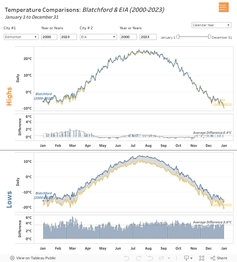
Here we have the average temperatures for 2000-2021 for Blatchford (near downtown Edmonton) and for the International Airport (30km south).

Throughout the year the average Highs are fairly similar, with Blatchford averaging about 0.4°C warmer than the airport. That varies depending on the season though, and the biggest difference occurs in late-February and March, when the city's Highs are about 2°C warmer than the airport.

The Lows for the two stations are quite different, with Blatchford on-average 3.6°C warmer than the airport. That difference is fairly consistent through the whole year, but it also peaks in March with Blatchford's average Lows about 5°C warmer than the airport's.


Average Winter Differences
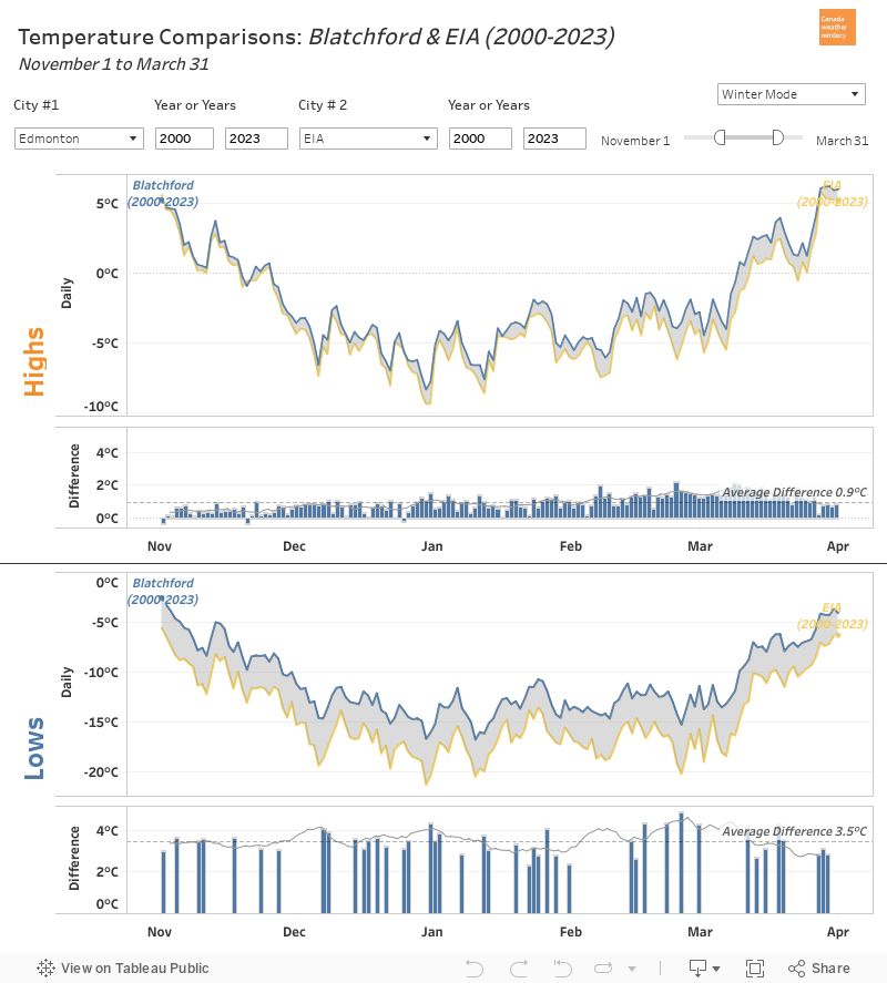
Here is the same chart, but now we are just looking at the winter months of November-March. The gap for the Highs is smaller than the gap for the Lows, but they are both largest right around the start of March.

These are the average winter temperatures over two decades - so it includes all of the deepfreezes, but also the typically cold or warm days. Let's get away from averages and take a look at one specific winter:


Winter of 2019-2020
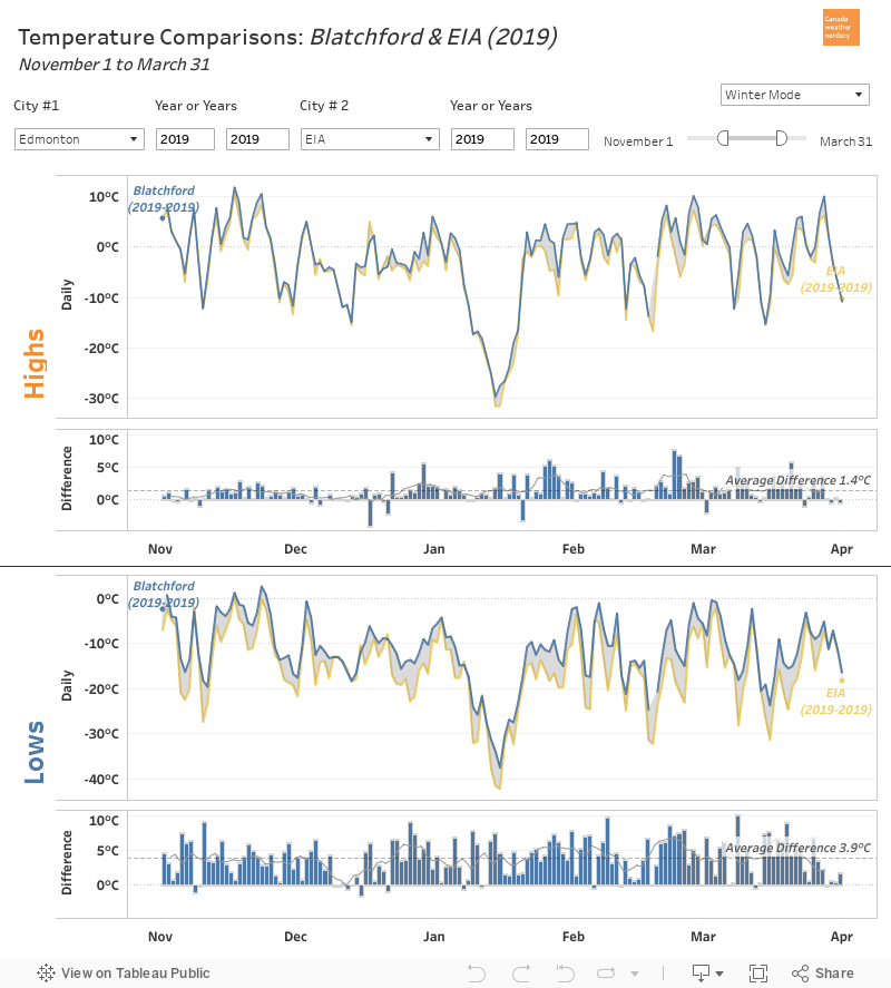
These are the temperatures at Blatchford and the airport for the winter of November 2019 through March 2020. On January 15, 2020 Blatchford hit -37.6°C which is very cold for the city, and that's why we picked this winter as an example.

The average differences across this whole winter are similar to what we saw for the 20-year averages, but on individual days the differences can be much larger. The largest were:

  • March 8: 10.1°C difference, with Lows of -18.1°C at Blatchford and 28.2°C at the International.
  • February 8: 9.9°C difference with Lows of -10.5°C at Blatchford and 20.4°C at the International.
  • December 26: 9.2°C difference with Lows of -13.6°C at Blatchford and 28.2°C at the International.

Those are just examples, but none of them happened to be on super-cold days. For the really cold -37.6°C day at Blatchford the airport was 4.7°C colder at -42.3°C.

All of that is just to give a sense of how things can compare between Blatchford and the International.


Now let's take a look at how things have changed over time, and we will add in a few more stations:

Deepfreezes: -25°C Lows at Blatchford
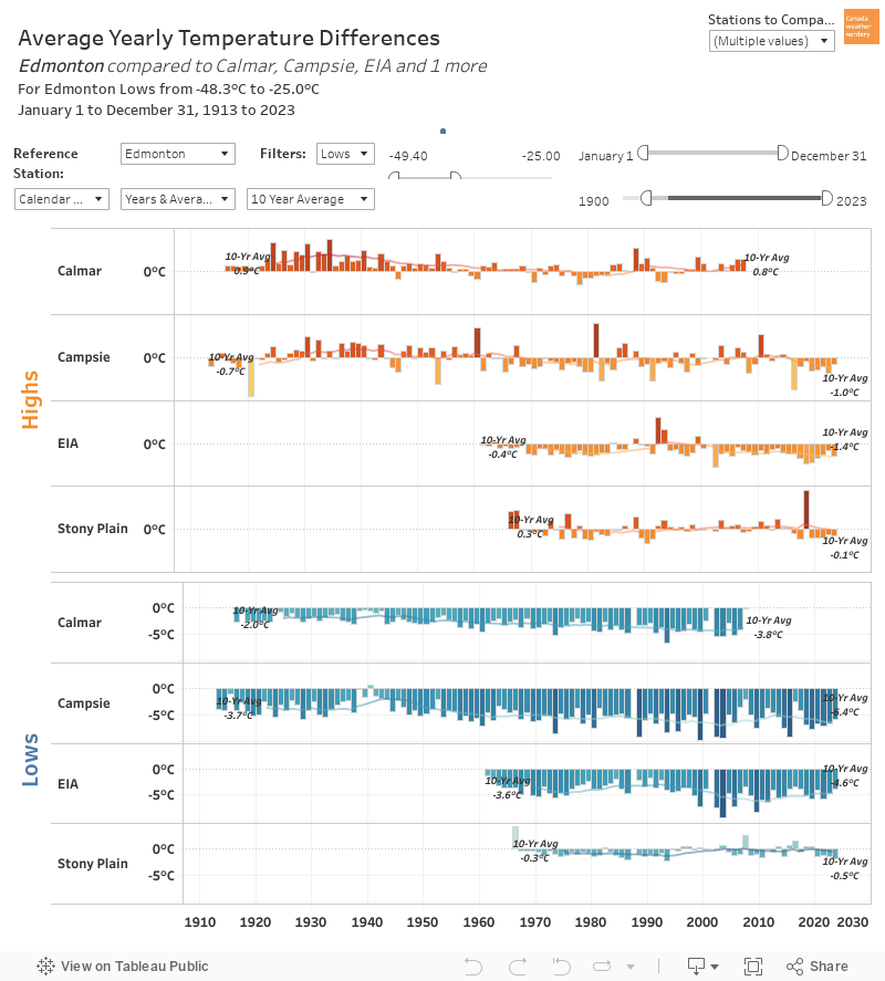
We will be using a few different versions of this chart, so let's start with a short explanation:

  • This compares the temperatures at Blatchford to 4 outlying stations which have long~ish histories.
  • A positive bar (a bar above zero) means that the outlying stations was warmer than Blatchford. Negative bars mean that the outlying stations was colder, while Blatchford was warmer.
  • This is only for the days where Blatchford had a High of -25°C. There will be more days where the outlying stations were cold but Blatchford wasn't, but those aren't included here. For this example Blatchford is the reference.
  • The bars here are the average difference for all of the cold days in each year. We only get about 10 -25°C Lows per year, so the sample size is pretty small, and can be swayed by outliers if there was only one or two days.

With all of that out of the way, what do we see here?

Let's start with the Highs:

  • 100 years ago when Blatchford's Low hit -25°C the Highs at the Campsie & Calmar stations  were on average warmer than Blatchford's.  But by about 1970 that gap had closed and the Highs were roughly equal.
  • In the 1960s the International's Highs averaged about -0.4°C cooler than Blatchford. Nowadays that has maybe increased to a -1.3°C difference?
  • For Stony Plain the Highs are pretty close. There are a few tall outlier bars here, but in general the average difference is a fraction of a degree, and that has been the case since the 1960s. 
For the Lows:
  • 100 years ago on cold days when Blatchford's High hit -20°C the Lows at Campsie & Calmar were colder than Blatchford's, and they're still colder today. The difference has gotten bigger, though. Calmar's Lows averaged -1.9°C colder in the 1920s, but the gap had increased to -3.8°C when the station shut down in 2007. For Campsie the gap was -3.4°C in the 1920s, and is close to -6.1°C today.
  • In the 1960s the International's Lows averaged -3.6°C colder, and today it's about -4.6°C colder.
  • Stony Plain's Lows are again quite close to Blatchford's. In the 1960s the gap averaged -0.7°C, and today it is -0.2°C.
As we saw earlier, Blatchford's Highs are fairly close to the outlying stations, while the gap for the Lows is larger. Looking back 100 years Blatchford's Lows were always warmer than Campsie & Calmar, but over the past century the gap increased by 2~3°C. And while we are used to seeing ridiculously cold temperatures at the airport, the average difference between Blatchford and the airport has only changed by about 1°C since the 1960s.


Deepfreezes: -30°C Lows at Blatchford


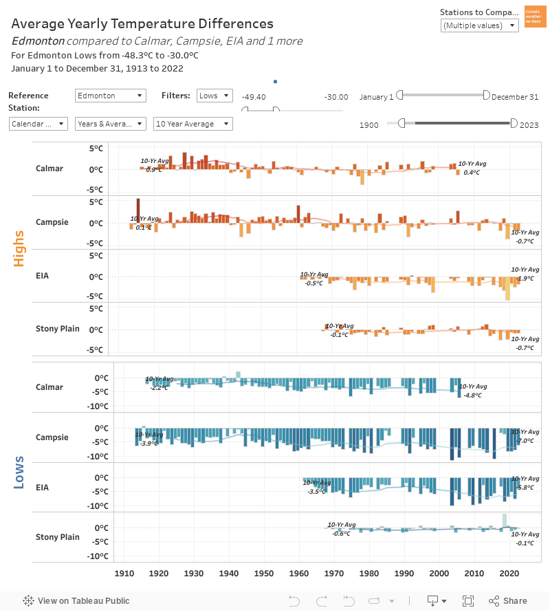
A -25°C day at Blatchford is pretty cold, but let's take it up a notch and only look at days where Blatchford's Lows reached -30°C. Once again, the sample size is quite small with usually only a few days each year.

The Highs look pretty similar to what we saw in the -25°C graph.

For the Lows the outlying stations are consistently cooler again, but the numbers have changed a bit. 
  • For Calmar, when Blatchford hits -30°C the gap was -2°C a century ago, and grew to -5°C by 2007.
  • For Campsie the gap grew from -4°C a century ago to -7°C today.
  • For the airport the gap was -4°C in the 1960s & 1970s, but is more than -6°C today.
  • And when Blatchford hits -30°C, on average Stony Plain isn't very different.

There is a sample size issue here, because we get fewer -30°C days than we used to, so the recent years are counting fewer days. But at least in terms of perception, when Blatchford hits -30°C stations like the airport and Campsie average -6°C colder. 


Deepfreezes: -35°C Lows at Campsie


Here is one more version, but this time we've flipped things and are using the outlying station Campsie as the reference. This is a temperature comparison for days when Campsie's Low reached -35°C.

For the Highs, once again all of the stations are relatively close, even on these extreme deepfreeze days.

For the Lows, when Campsie hits -35°C the International Airport and Calmar both tend to be a few degrees warmer, and that gap has been fairly consistent over the years. For Blatchford though, 100 years ago the gap was around 7°C, while in modern years it has been closer to 10°C. And for Stony Plain the gap increased from 7.9°C to 9.2°C since the 1960s.


Summary

We have talked about the Heat Island Effect many times here, and it is because Edmontonians are used to seeing these huge temperature gaps between Blatchford and the airport. And that can lead to the idea that the airport is the "natural" temperature, while Blatchford's gets an artificial increase because it is the big city. But is that correct?

As we have seen with these stations, there is a much bigger urban-rural gap for the daily Low temperatures than for the daily High temperatures. And that gap existed in 1960 when the airport opened, and it also existed in 1920 when records began at stations like Campsie and Calmar.

But we also saw that for very cold days the gap has increased by 2~3°C over the past century. So it would appear that nowadays, during deepfreezes Blatchford's Lows do get a bit of lift relative to the outlying stations. However, there are also outlying stations like Stony Plain which have temperatures pretty close to Edmonton's.

The moral of the story is that during a deepfreeze when see that Blatchford is 7~10°C warmer than the airport, on a similar day in 1960 that gap would have existed, but it might have only been 5~8°C? And going back to 1920 it might have been 4~7°C? What about 1880? Unfortunately we don't have the data to go all of the way back to see how a truly rural Edmonton compared to its rural surroundings.

2021/07/19

Heatwaves & Heat Islands: Part 2

We are back to talk about the heat island effect again today, and how heatwaves may or may not exaggerate the temperature differences between rural and urban stations.

In Part 1 we looked at the individual daily temperatures during 3 of Edmonton's most notable heatwaves - 2021, 1961, and 1924. On extremely hot days:

  • The High temperatures for all of the stations around Edmonton are generally pretty close to one another.
  • The Lows temperatures for the Blatchford station in Edmonton are generally several degrees warmer than at the outlying stations, but that occurred in all 3 of the heatwaves going back to 1924.

Today we want to see if there are any trends to be seen, and we will be focusing on a few Edmonton-area Environment Canada weather stations.

  • Blatchford is in Edmonton, about 2km north of downtown with data from 1880-today.
  • Campsie is 100km northwest of Edmonton with data from 1913-today. 
  • Calmar is 40km southwest of Edmonton with data from 1916-2007.
  • The International is 30km south of Edmonton with data from 1961-today. 
  • Stony Plain is 40km west of Edmonton with data from 1966-today. 

Campsie is the most truly rural station of the bunch:


Summer Temperature History

To start with, here is the history of 10-year average temperatures for these stations for the "summer" months: from June 1st through August 31st.

Blatchford is the longest line in dark blue, and for the Highs temperatures it is mostly in the middle of the other stations. Stony Plain in Pink is the most recent station to start, and in the beginning its summer Highs were well below the other stations, although since about 2005 it has closed most of the gap.

For the Lows Blatchford is well above all of the other stations, with Stony Plain in the second spot. The Lows for Calmar, Campsie and the International are all clustered together.

In terms of trends the average summer Highs for most of the stations look pretty flat, with the exception of Stony Plain which has jumped up closer to the other stations. For the average summer Lows all of the stations have warmed, except for the International which has dropped 0.2°C since the 1960s. For the other stations Blatchford is up 3.9°C over 140 years, Campsie is up 2.5°C over 100 years, Calmar was up 2.2°C over 91 years, and Stony Plain is up 0.7°C over 55 years.

So in general the average summer Highs around Edmonton aren't all that much different than they were a century ago, but the summer Lows are up by 2.5~4°C. We talked about this more in Why Heatwaves Aren't the Whole Story. (also, today we are just looking at summer temperatures, but the temperature changes during the winter are much larger).

The word of the day is "Relative" because what we really want to know is how the temperatures at these stations have changed compared to one other. If the heat island effect disproportionately affects big cities, then theoretically Blatchford's temperatures should have warmed faster than the outlying areas.


Summer Temperature Comparison
This chart uses the temperatures at Blatchford as a reference, and it shows the average difference each summer (June 1 - August 31) for each of these stations. 

For the average summer Highs Calmar was actually a little warmer than Blatchford after around 1930. And as we saw earlier Stony Plain's Highs started 1°C or more colder than Edmonton, caught up to the city for 2010~2015, and then just recently have been 0.8°C cooler again. For Campsie and the airport the differences have bounced around, but similar to Stony Plain for the past few years they've been about 0.5°C cooler than the city. 

For the average summer Lows Stony Plain has been closest to Edmonton, at around 1°C cooler than the city since the 1960s. For the other stations the average Lows are now around 3~3.5°C cooler than the city, and that gap has grown by about 1°C since records started.

Is that ~1°C change the Heat Island Effect? It could be, although for Campsie and Calmar it looks like most of the change happened from 1915-1960, and things were pretty flat after that. In 1960 Edmonton's population was 269,314, and the city had a much smaller footprint than it did today.

For the airport it does look like the gap widened around 2000, but that's probably because the airport is weird. Here's the same chart, except that it is flipped to use the airport as the reference station:

Using the airport as a reference we are only looking at 1960-today. And around 2000 Blatchford did get warmer than the airport, but so did Campsie and Stony Plain. Stony Plain has urbanized and grown since 2000, but Campsie hasn't, so this is probably more about how notoriously cold the airport is, rather than the Heat Island Effect.

Summing up so far:

  • Blatchford's summer Highs are pretty close to the neighbouring stations, and have been since 1915.
  • Blatchford's summer Lows are 2~3.5°C warmer than the neighbouring stations, and have been since at least the 1960s. Going further back to 1915 Blatchford was still warmer, but by slightly less at maybe 1.5~2.5°C.

So now we know what the history of typical summer temperatures looks like. What about the heatwaves?


30°C Days Temperature Comparison
This is the same chart again, except this time instead of looking at the whole summer we are focussed on days where Blatchford's High hit 30°C. 

On thing to keep in mind with this chart is that we're dealing with a very small sample size. Edmonton averages about 4 30°C days each year, but many years only get 1 or 2, and some get none. And so each bar in this chart is the average temperature difference from only a handful of days. That's why for the Highs Campsie has 1 giant bar in 2011 for a single day when Blatchford hit 31.5°C, and Campsie was down at 20.5°C. Also, in this chart years which had lots of 30°C days will be an average of all of those days, and might look less extreme than single days. But we wanted to talk about what the Heat Island Effect looks like on Edmonton's hottest days, and these are the hottest days.

For the Highs the differences are pretty small, with Blatchford typically 0.5~1°C warmer than the other stations on these very hot days. And as for the question of how that has changed over time: it really hasn't, has it? Stony Plain has actually closed the gap with Edmonton by about 0.5°C, and the other stations are all around where they were 50 or 100 years ago.

For the Lows the differences are larger than the Highs again. Stony Plain is pretty close to Blatchford with overnight Lows about 1°C cooler on these hot days, and that gap has closed from 2°C 50 years ago. For the other stations the gap is in the range of 4~5.5°C, which is up from 2~3.5°C a century ago. Again though, for Calmar and Campsie most of the change happened from 1915-1960. For the International the gap has increased from 3.7°C to 4.6°C since 1960.


32°C Days Temperature Comparison
We can play this game one more time with 32°C days, which happen on average about every other year. 32°C days are uncommon enough that most of the bars in this chart represent the temperature differences on a single day (or maybe two) when Blatchford hit 32°C.

For the Highs, in recent years when Blatchford has hit 32°C:
  • Campsie has generally been about 1.5°C, but sometimes it's or 3.5°C cooler, and a few times it has been warmer. Going back through history most of these bars are in the 0/1.5/3.5°C coller range (with 1932 as a standout at 7.7°C)
  • The Airport has been 1.5~3°C cooler, which hasn't changed since 1960.
  • Stony Plain has been 1~2°C, while in the 1970s & 1980s the difference was 2~3°C.
  • Calmar doesn't have recent data, but from 1915-2007 it was in the 1~2°C range without much change.
For the Lows when Blatchford has hit 32°C:
  • Campsie Lows are about 5~7°C cooler, which has been pretty typical since about 1960. Before that the difference was around 4~5°C.
  • The Airport's Lows are also 5~7°C cooler, compared to 3~5°C in the 1960s & 1970s.
  • Stony Plain's Lows range from 1°C warmer to 2.5°C cooler than Blatchford's. That is warmer than in the 1960s & 1970s when the difference was 4~5°C.
  • And Calmar was in the range of 3°C for 1915 through 1960, and then 4°C for 1960 through 2007.

15°C Lows Temperature Comparison
One notable thing about the 2021 heatwave was the large number of warm overnight Lows which we had, so here is a final version of the chart for nights when Blatchford stayed about 15°C. Many of these dates will overlap with what we saw in the 32°C chart, but it's worth focussing in on those hot nights in particular. (once again though, this is a very small sample size)

And what do we see?

On those hot night the Highs at the outlying stations were generally ~1°C cooler than Blatchford, although there doesn't seem to be much of a change from 1915 to 1960 to 2021.

And for the Lows Blatchford was 2~5°C warmer than the other stations. Most of the stations look pretty flat, although with Campsie it again looks like the gap got bigger from 1940~1960.

You can also set the dashboard to show the really hot Lows like 17°C, or 19°C, but prior to 1960 there were almost none of those and so the history is shorter.


Summary
So what was the point of all of this?

This image shows the daily temperatures from the great heatwave of 2021. In the past on this blog we have repeatedly discussed how overstated the impact of the Heat Island Effect is. And yet...when I saw these temperatures my first thought was "Wow, that's some big Heat Island Effect."

But when we take a closer look, was this really the Heat Island Effect? The High temperatures were actually quite close across the region. And for the Lows Blatchford was definitely much warmer than neighbouring stations, but that has been the case since at least 1915.

So today leaves us with some unanswered questions. Blatchford is warmer than its surroundings, but that was also mostly the case a century ago, so what is going on? All that we can do is speculate, but a few ideas come to mind: 
  • The downtown area might have a microclimate which makes it warmer than the surroundings. That might be why there is 8,000 years of history of Indigenous use of areas like Rossdale, rather than at a place like the airport? (disclaimer: I do not know anything about the Indigenous history of locations like Stony Plain or Campsie)
  • Blatchford is still a big empty field with a few old runways, next to a freeway and a railyard. Maybe it doesn't actually feel the Heat Island Effect the way an downtown does.
  • Maybe the Heat Island Effect's biggest impact is early on, when a city grows from 0-400,000 people. As a city spreads (or sprawls) outwards the Heat Island might affect a larger area, but it doesn't get more concentrated.
  • Maybe the Heat Island Effect is really, really big, and even a location like Campsie 100km away still feels the majority of it.
That's all speculation though, and speculation is terrible. For all I know a Wizard did it. 

But I think there are 2 big takeaways from today:
  • When we see a 5°C temperature difference between Blatchford and the airport, that does not mean that the airport is the "natural" temperature, and that the big city has warmed itself up by 5°C. The vast majority of that temperature difference also existed 50 or even 100 years ago. And we now know that is also the case during extreme temperatures like heatwaves.

  • For the Calmar & Campsie stations with long histories it does look like the city's summer Low  temperatures got relatively warmer by about 1°C from 1915~1960, but then after that things flattened out.

2021/07/13

Heatwaves & Heat Islands: Part 1

Today we are going to take another look at the Urban Heat Island Effect. This is the idea that cities are warmer than rural areas, and that cities are also warming faster than rural areas, because cities absorb, generate and concentrate heat.

Why is the heat island effect interesting?

  • Every day in Edmonton we see temperatures from downtown, and at the airport. There is often a huge difference between the two stations: 5°C, or even 10°C. So it is really easy to get into the mindset that Edmonton is warm because it is a city, and that if the city were not here then the temperatures would match the Airport, because the Airport is the "natural" state. But it's more complicated than that.
  • Climate change deniers like to use the heat island effect to dismiss climate change, and to say that all data is biased because of course cities are getting warmer and yadda yadda.
Today we will mostly be looking at the first point, although some of that will spill over into the second point too.

So the heat island effect is interesting, but why do we need to look at it again? Haven't we already done this?

The reason for today is because we just had a historic heatwave, and maybe the heat island effect looks different during extreme temperatures?


Heatwave 2021

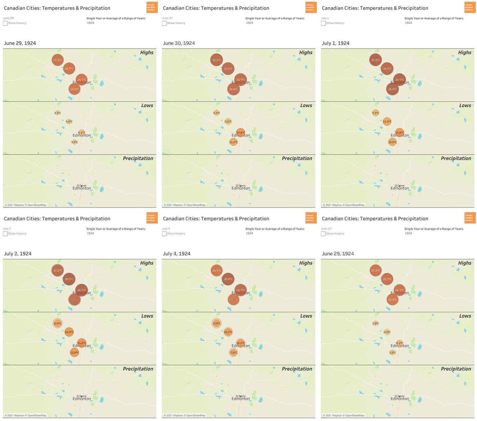
This chart cycles through the daily High and Low temperatures for Environment Canada stations in the Edmonton area for June 24th through July 3rd. The main 30°C+ heatwave was June 25th through 2nd, but the 24th and 3rd were also pretty warm, so they're included here too. The dashboard with this daily data is here, but it's pretty slow so we will stick to images for a bit.

The Blatchford station near downtown is at the centre of the group of stations. For the Highs Blatchford was usually among the warmest stations, but several of the outlying stations like Namao and St. Albert had hotter days. And for cooler stations the International Airport's Highs were generally 1°C or 2°C below everywhere else.

For the Lows Blatchford was the warmest of the group for every night here, except for June 30th when it was below the Namao and Oliver stations in the northeast. For the nights when Blatchford was the warmest it could be 1°C, or 2°C, or even 5°C warmer than some of the other stations.

And this is where we fall into the trap: cities are warm, and so the reason that Blatchford is warm is because it's in the big city, right? Let's see...


Heatwave 1961
Here we have the temperatures for the great heatwave of June 1961. There are fewer stations, so this one is zoomed out a bit, and in the upper left corner is Campsie which is about 100km northwest of Edmonton.

For the Highs Blatchford's temperature was fairly similar to the other stations, and Fort Saskatchewan in the northeast had several of the hottest days, by about 1°C. For the Lows Blatchford was consistently warmest again, and again by anywhere from 1°C, to 2°C, to 5°C depending on the station and the day.


Heatwave 1924

And finally, here is the earliest of our recorded heatwaves, for June and July 1924. This time we only have records from 4 stations. 

For the Highs all of the stations take turns as the daily hot spot. For the Lows Blatchford is the warmest for most days, and again by anywhere from 1°C, to 2°C, to  5°C.

This set of charts isn't great for spotting trends, but just generally it looks like the temperature distributions around Edmonton weren't all that different for the heatwaves of 1924, 1961 and 2021:

  • In 2021 Blatchford's Highs were similar to the neighbouring stations, and didn't get a boost just for being in the big city.
  • In 2021 Blatchford's Lows were usually several degrees warmer than the outlying areas, but that was also the case in 1961 and 1924 when Edmonton was much smaller.


Campsie vs Blatchford Through History

In this chart we have the 20-year average temperature difference throughout the whole year between Edmonton and Campsie. It has 3 different time periods: 2001-2020, 1961-1980 and 1915-1934.
The dashboard with all of this data is here.

Campsie is a great station to use as a guinea pig because it has data from all of the way back in 1915 through today, and so we can get a sense of how things have changed over the (relatively) long term. 

For the average Highs Blatchford is warmer than Campsie, but only by a little bit. The average differences during the whole year were 0.1°C for 1915-1934, 0.5°C for 1961-1980, and 0.3°C for 2001-2020. The difference tends to be the greatest during the winter, but the Highs are pretty close overall.

The Lows look quite different from the Highs, with a big gap between Campsie and the warmer Blatchford. The average differences were 2.6°C for 1915-1934, 3.4°C for 1961-1980, and 3.3°C for 2001-2020. The difference in Lows is also more seasonal than the Highs, with some winter days averaging 5°C or 6°C warmer in Edmonton, while the summer days are mostly below 4°C.


Campsie vs Blatchford Heatwaves

This is the same chart that we just saw, except this time we are zoomed right into the heatwaves of 1924, 1961 and 2021. It looks a little bit less pretty like this, but this shows the individual daily temperature differences between Blatchford and Campsie.

We saw earlier that during the year Blatchford's High are on average less than 0.5°C warmer than Campsie's. That doesn't seem to change much during historic heatwaves, because for almost all of the days here there's only a fraction of a degree between the two stations. The one notable exception was the final day of the 1924 heatwave where Blatchford was 10°C warmer than Campsie. But generally the Highs are really close, and they were also really close in 1961 and 1924.

For the Lows Blatchford averaged 4.9°C warmer than Campsie in the 1924 heatwave, 6.6°C in 1961, and 5.8°C in 2021. All of those numbers are above the typical summer difference which is less than 4°C. But just among these heatwaves, Blatchford's Lows were extra-warm for all 3 of them, and didn't get a particular boost in 2021.

We are going to end things here for Part 1. For right now the take away is that:
  • For the 1924, 1961 and 2021 the Highs for Edmonton and Campsie were generally very close (except on July 3, 1924).
  • At first glance Blatchford's warm nights in 2021 definitely looked like the heat island effect at work. But the vast majority of that difference also occurred 97 years ago in 1924.
Digging into the daily temperatures for these 2 stations to look at 3 heatwaves spread across a century is definitely cherry-picking the data. In Part 2 we are going to take a step back to look at some larger trends.

2021/06/29

2021 Heatwave Pre-cap: Part 3 - Why Heatwaves Are Not the Whole Story

This is Part 3 of our primer on heatwaves. In Part 1 we looked at Edmonton's previous heatwaves, and in Part 2 we compared those to other cities around the country.

(if you are reading this in the distant future some of the dashboards below may have updated to reflect new data or formatting, or they may be broken, or they may no longer make sense. To see the original images for this post refer to this twitter thread.)

If your read Parts 1 & 2 (they're super interesting) you might have noticed something strange: heatwaves don't seem to be more frequent today than they were 50 or 100 years ago. What's the deal?

We will not be able to solve that mystery - it will be left to the real climate scientists out there. But we are going to point out a few interesting bits of data, and why a laser focus on heatwaves and broken records misses some of the other stuff which is going on.

We won't recap all of Parts 1 & 2 again here, but this chart from Part 2 gets to the heart of the question:

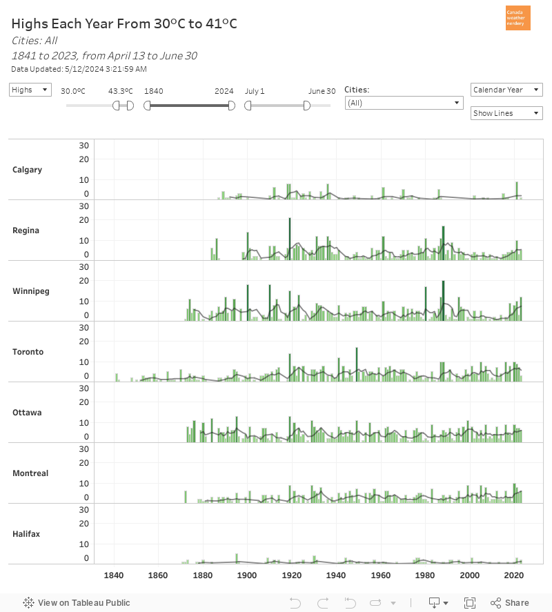
30°C Days Each Year
Here we have the number of 30°C days each year for 7 Canadian cities, going back to 1880. (Vancouver and St. John's don't get enough to bother including here, but they can be accessed from the dropdown on the upper right)

And the thing is...they're pretty flat, huh? Edmonton, Regina and Winnipeg all had a bit of a peak in the mid-1930s for some reason. For Calgary that peak was around 1920, for some reason. And for the central Canadian cities there was a bit of a lull around 1980 for some reason, and then recently things have climbed back up again.

This is just the 30°C days, but we see something similar at 32°C, 35°C, and even 28°C. There hasn't been a huge increase in hot or super-hot days each summer.

So does that mean that summer is not getting warmer? Let's take a look...


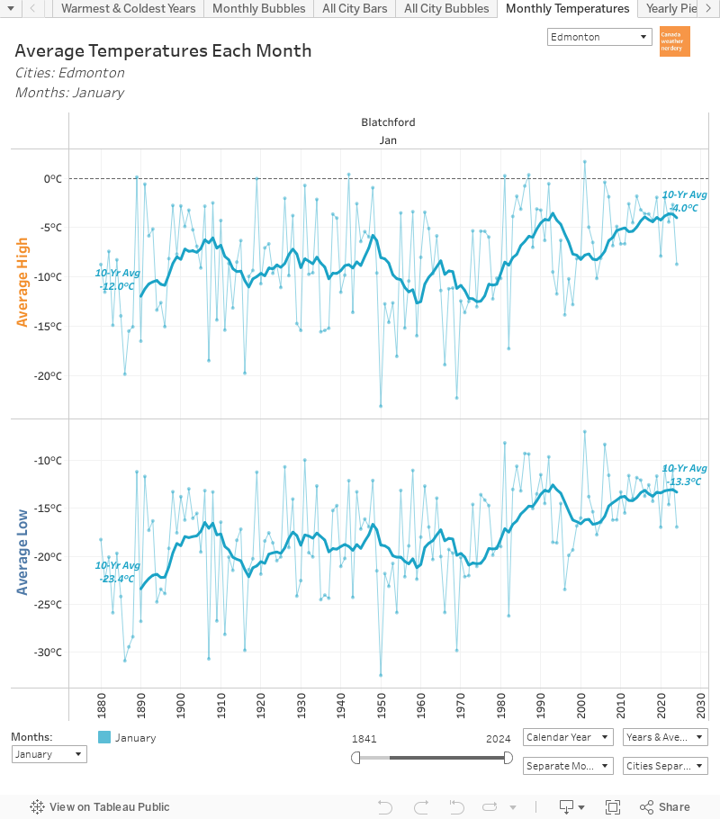
Average Summer Temperatures in Edmonton
Here we have the average High and Low summer temperatures for June, July, and August in Edmonton. Since 1880 our summer High have been fairly flat: up by 0.7°C in June, 1°C in July, and 1.2°C in August. In comparison the Lows for June are up by 3°C, and for July and August they're up by 4°C.

A 1°C change in Highs over 140 years isn't nothing. But when that 1°C is spread over an entire month it hasn't been enough (so far, anyway) to push average ~23°C days up into 30°C heatwave territory.


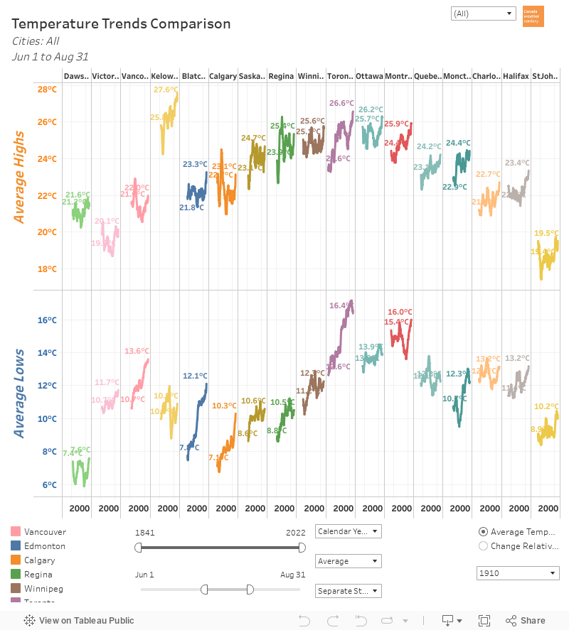
Average Summer Temperatures Across Canada
Here we have the same idea, with the average temperatures for June, July and August combined for each of these cities.

For all of these cities the Highs have been fairly flat:

  • Vancouver had a weird spike around 1930, but is now at the same level as a century ago.
  • Edmonton is up by 0.9°C.
  • Calgary had a weird spike around 1920, but is flat over the century.
  • Regina had a weird spike around 1940, and is up by 1.1°C.
  • Winnipeg also had a spike around 1940, and is up by 0.4°C.
  • Toronto has 40 years more history than most of the other cities, and is up by 3°C.
  • Ottawa is up by 0.5°C.
  • Montréal is up by 1.4°C.
  • St. John's is flat overall.

Of all of these cities Toronto and Montréal are the only ones which have had a reasonably consistent increase in their Highs. And then Regina and Edmonton are next with more wobbly paths to their 1°C increases.

For the Lows Vancouver, Edmonton, Calgary and Toronto are all way up, by 3~4°C. Below that Regina, Winnipeg, and St. John's have warmed by 1~2°C. And for Ottawa and Montréal the Lows have been fairly flat.

So the point of all of this is that during the summer everyone always wants to talk about the High temperatures, with their heatwaves and new records. But for a lot of Canada (especially western Canada) the Low temperatures are the real news.


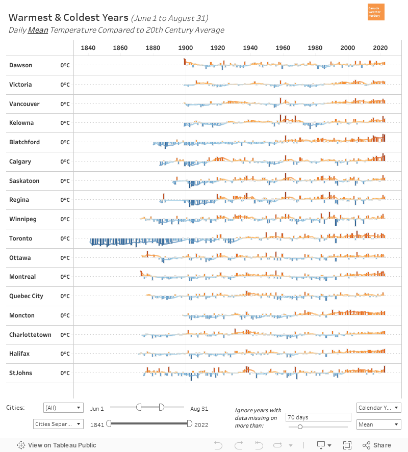
Warmest and Coolest Summers
This is another way to look at it, with the history of the warmest and coldest average High temperatures during the summer, compared to the 20th century average. Cities like Edmonton, Calgary, Toronto, Ottawa and Montréal have seen a number of warm summers in recent years, but generally the warm/cold mix is fairly all over the place.

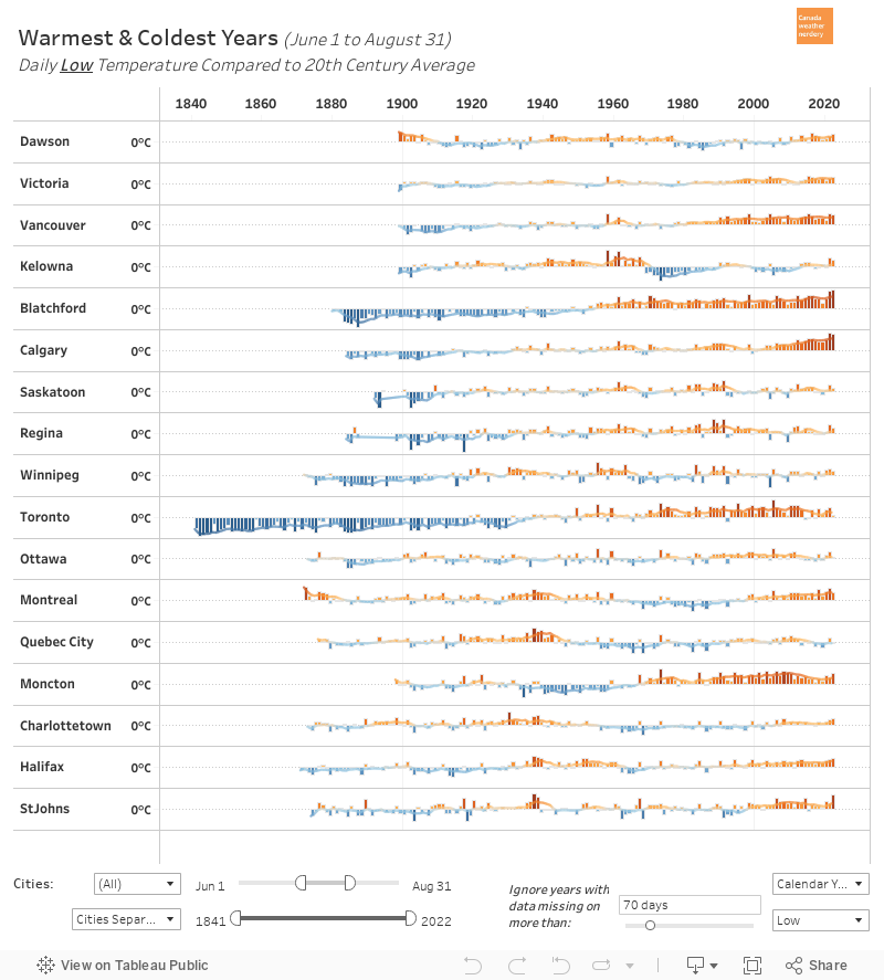
But meanwhile for the Lows...

For the average summer Low temperatures Regina, Winnipeg and Ottawa haven't really seen anything special recently. But all of the other cities have had lots of orange bars since 2000.


It's just cities though, right?
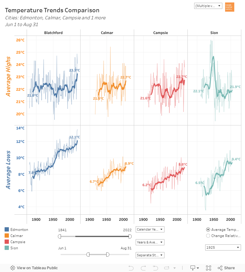
A reasonable assumption is that the reason the Highs and Lows have increased is because Toronto, Vancouver, Edmonton and the others are cities, and cities are warm. And so here we have the average Highs and Lows for June, July and August again, but this time it is for Edmonton and 3 nearby rural stations.

Again we see Edmonton's flat~ish Highs, and a big increase in Lows. But we see something similar for the rural stations as well.

(What was going on with Scion's High temperatures around 1950? No idea. It only happened to the Highs and not the Lows, and it's only at that station, and it's a mystery.)


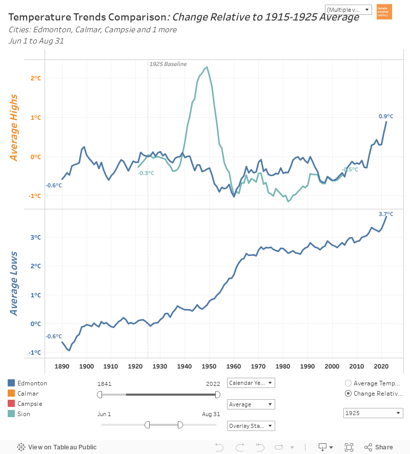
This chart has the same data as the previous one, but to make it easier to compare here the temperature changes are relative to 1915-1925, when the recordings for the rural stations all started.

Viewed this way Blatchford's Highs warmed a little bit less that Campsie and Calmar, and its Lows warmed a little bit more. Scion is all over the place, and its Highs were similar to Edmonton's, while its Lows were the warmest of the batch. 

The point of all of this is just to show that Edmonton's warming isn't only because it is a city. The rural stations aren't a perfect match to Edmonton, but they are not flat and have warmed along with the city.   


Rural versus Urban Across Canada
And finally, here we have one more example of urban and rural stations across Canada. It's tough to find rural stations with long temperature histories, and these 5 are some of the best that Environment Canada has got.

There is a lot going on here, but the point again is that cities do not warm only because they are cities. The Lows for the rural stations in BC, Alberta, Saskatchewan and Ontario all look very similar to their big city neighbours. And for the Highs for the BC, Alberta and Quebec stations all look like their cities.

Again, these definitely aren't a perfect match. But warming also definitely is not limited to the big cities.

One day here at Edmonton Weather Nerdery we will do a giant series of writeups on the heat island effect, and the temperature differences between urban and rural stations. Today is not that day though, and so we will leave things with this quick comparison of a few cities and their neighbouring stations.

2019/12/16

City Temperature Comparison - Dashboard

Today we are going to take a look at a dashboard that lets us compare the temperatures from different weather stations in a bunch of different ways.

We will begin, as always, with Edmonton vs. Calgary.

Edmonton & Calgary: 30-Year Average Temperatures


Here we have the average daily temperatures for Edmonton and Calgary. For complicated reasons this chart unfortunately doesn't have a legend, but Edmonton is the darker blue, and Calgary is lighter. The top half shows the High temperatures, and the bottom half has the Lows. The linecharts are the temperatures themselves, and the barcharts are the differences between the two cities. And if you hover over the dashboard it will give the numbers for the various days.

We will talk about this more in detail in a bit, but in general we can see:

  • Edmonton's average Highs during the winter are quite a bit cooler than Calgary's - the difference is about 4°C or 5°C for December & January.
  • Edmonton's average Lows during the winter are only a bit cooler than Calgary's - the difference in January is about 2°C.
  • Edmonton's average Highs for May & June are maybe a degree or two warmer than Calgary's .
  • Edmonton's average Lows for May-September are about 2°C warmer than Calgary's.

The biggest differences are during the winter, and so I think it will be easiest if we flip this chart from January-December to a more winter-centric July-June:


Edmonton & Calgary: Winter-centric Version


Here we have the same data that we were just looking at, but this time it runs from July-June so that the winter falls in the middle of the chart.

And for the Highs we can see that Edmonton and Calgary are pretty close for most of the year, but things start to diverge around November and then join back up around April. The big difference in the average Highs peaks in mid-January, with Calgary's average at around 0°C and Edmonton's at -7°C.

For the Lows during the summer Edmonton is usually a few degrees warmer, but then as we move into winter that flips and Calgary is a bit warmer. That also peaks around mid-January, with Calgary at -13°C and Edmonton a few degrees cooler at -16°C, but the difference is much less than with the Highs.


Edmonton & Winnipeg


And as usual, after looking at Calgary here we've moved on to Winnipeg.

For the average Highs during the summer Winnipeg is 3°C or 4°C warmer than Edmonton. But in the winter that flips, and in January & February Edmonton's average Highs are 5°C to 7°C warmer than Winnipeg's. If you switch the dropdown in this dashboard to Calgary, their average Highs in January are 10°C to 12°C warmer than Winnipeg. Calgary's average Highs bottom out at about -4°C, for Edmonton it's -8°C, and for Winnipeg it's -13°C.

For the average Lows Edmonton and Winnipeg are fairly similar during the summer, but then in the winter Edmonton's Lows are 8°C to 10°C warmer, and Calgary's are 10°C to 12°C warmer. Calgary's average Lows bottom out at about -16°C, for Edmonton it's -17°C, and for Winnipeg it's -23°C.


Edmonton & Montréal


These dashboards have the data for 9 Canadian cities, and we won't go through all of them here, but we will do one more example with Montréal. Not surprisingly, on-average Montréal is warmer than Edmonton for most of the year. But what might be surprising is how close the average temperatures are in January-March.

For the Highs the biggest gap is in November & December, with Montréal about 7°C warmer than Edmonton's cool falls. For February, March & April that difference basically disappears though - Edmonton gets colder days than Montréal, but also more warm ones. And in the summer Montréal's average Highs are about 3°C warmer than Edmonton's.

For the Lows things are similar, with Montréal about 7°C warmer than Edmonton in November & December, about the same in January & February, and then about 4°C warmer for most of the year.

Here's a look at Edmonton, Calgary & Winnipeg all compared against Montréal. In January & February Calgary's average winter Highs are actually about 4°C warmer than Montréal's. And Montréal is pretty consistently warmer than Winnipeg, although the summer Highs are similar.


Edmonton & Calgary: 2019


Everything that we have looked at so far today has been 30-year averages, but this dashboard can also be used to compare a single year. Here we have the temperatures for 2019 for Edmonton & Calgary.

The daily temperatures for the two cities follow each other very closely - the extremely cold February 2019 shows up in the Highs & the Lows for both Edmonton & Calgary.

The largest gap 18.7°C on January 10th with Calgary's High up at 9.8°C while Edmonton's was down at -8.9°C. The largest gap for Edmonton was 12°C on May 21st, with Edmonton at 19.6°C and Calgary at 7.6°C, and that was part of an entire cool week for Calgary.


Edmonton History


One other thing that we can use this dashboard for is to compare Edmonton's current temperatures to its past. Here we have the 20-year average for 2000-2019 compared to 1880-1899

Unfortunately because of the way this is set up both eras appear in blue, but in the bargraph a value that is above 0 means that 2000-2019 is warmer, and below 0 means 1880-1899 was warmer.

For the Lows we can see that modern temperatures are warmer than they used to be for almost the entire year (with a weird little exception right around December 8th). Typically modern Lows are about 4°C warmer than they used to be, but in January & February that increases to 8°C to 10°C.

For the Highs January & February have also seen the biggest changes, warming by about 6°C. For the rest of the year the Highs are a little more variable. For the summer months of July, August & September the modern average temperatures are a little bit warmer, but generally by less than 1°C.


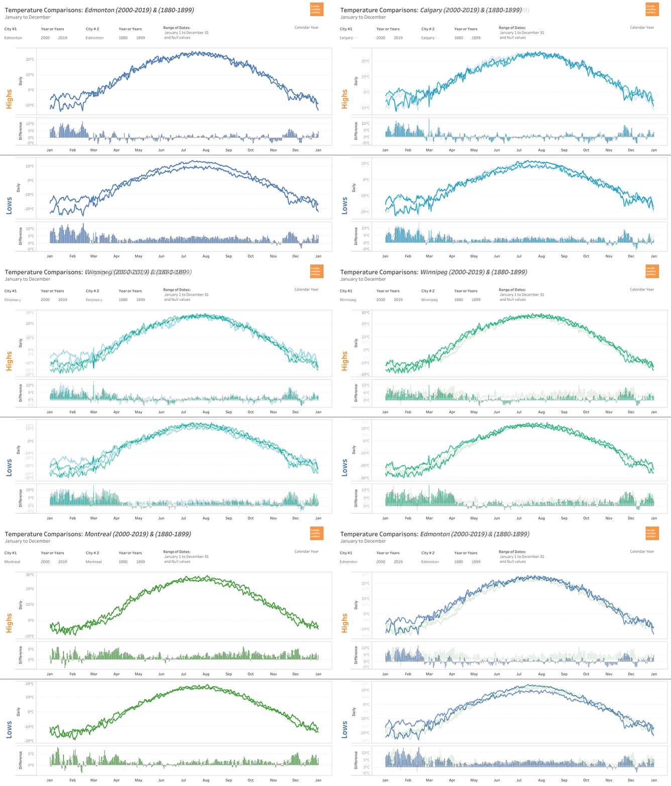
For some context here we have 2000-2019 vs. 1880-1899 for Edmonton, Calgary, Winnipeg and Montréal. It's easiest to focus on the bargraphs, and the patterns for Edmonton, Calgary & Winnipeg are all quite similar, with lots of warming in the winter, and a year-round increase in Low temperatures. Montréal is a bit different though, also seeing an increase in late-summer High temperatures.


This chart is the same idea, but it cycles through all of the years since 1880 for Edmonton. Watching all of the years roll by the big changes really start to happen in 1980-1999, and then 2000-2019.


Blatchford & The Edmonton International: 2019


One final thing that we can do with this dashboard is compare the temperatures of downtown Edmonton (Blatchford) to the International Airport.

For the average High temperatures the two stations are fairly close for most of the year, with the biggest gap happening in the spring with Blatchford about 1.5°C warmer than the International. For the average Lows the International is about 3.5°C colder than Blatchford for most of the year.

Those are just the averages though, so let's look at one specific year:


Daily data is a little bumpy, and so here it's easiest to focus on the bargraphs. For the Highs we see a lot of spikes in March with Blatchford 5°C or 8°C warmer than the International.

For the Lows, for some of the very cold days in February there was a 10°C or 12°C difference between the stations: on February 4th Blatchford hit -29.5°C while the International was at -39.5°C; on March 2nd Blatchford was at -28°C with the International at -36.9°C, and on March 6th Blatchford hit -19.1°C with the International at -29.2°C.

You might think that Blatchford is warmer just because it's the big city, but we can compare the airport to a few other outlying stations:


Blatchford tends to be the warmest station in the region, but Stony Plain's winter Lows also average about 4°C warmer than the International. For Namao and Ft. Saskatchewan the differences are not as big, but they're also both consistently warmer than the airport. We have talked about this before, but when the airport gets cold it gets really cold.

And that brings us to the end for today. All of these examples were Edmonton-centric, but the data is also available for Vancouver, Calgary, Winnipeg, Toronto, Ottawa, Montréal & St. John's.