I couldn't include 2016 in that comparison because there are still several months left, and that wouldn't have been fair.
But today we'll be looking at each year on a day-to-day basis, so we can see exactly how 2016 stacks up against all the rest.
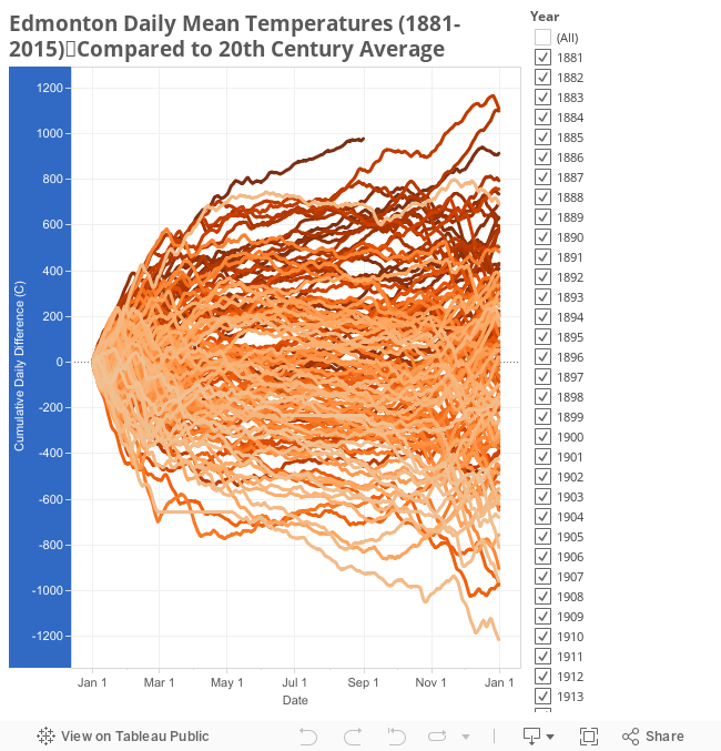
There is a tonne of data today, and I'm struggling a bit with how exactly to present it, so we're going to take things in steps.
To start things off, here's the whole mess of data:

Beyond that though, this is basically impossible to read. What it is trying to show is how each year from 1881-2016 varied from the 20th century average, on a day-to-day basis.
To clean things up a bit, here is the same data condensed into Highs/Lows/Quartiles, with 2015 shown as a reference:

For both 2016 and 2015 the first few weeks of January were actually pretty cold: a little above the 20th century average for 2016, and actually a bit below that for 2015. But by late January both years had picked up and were above the 75th percentile (although just as a reminder, this is a comparison to 136 years, and not just to recent history). By the time we'd reach April, 2016 was the warmest year ever recorded, while 2015 climbed pretty steadily for the whole year.
As of August 31 the score for 2016 is 978°C, and for all of 2015 the total score was 914°C. What do those numbers mean? Unfortunately they're pretty abstract, and aren't actually anything that you can feel. Here is an explanation of where they come from, using 2015 as an example:

The bottom section is a running total of all of those differences for the year. So if today's weather report says that it was 20°C today, but the average for this time of year is only 15°C, then that would be a difference of 5°C. (with a note that this uses the mean temperature for the day, rather than the daily high or low, but the general idea is the same). The combination of all of those daily differences gives us the total score of 914°C for 2015.
So a score of 978°C for the first 8 months of 2016 isn't something that you can feel, but as a way to calculate a running-total for each year it seems to make sense.
For a little bit more context, here is 2016 compared to the last 10 years:

With this we can see that 2015 is quite a bit higher than the others. 2006 and 2005 are in 8th and 9th place overall, with totals around 600°C, compared to 2015's 914°C which is in 3rd spot. And the coolest year was 2009 in 68th place, which actually stayed quite close to the 20th century average for the whole year.
While all of the last 10 years ended up above the 20th century average, it's maybe a little interesting that 4 of them didn't break the 75th percentile range. Looking at 136 years of data I'd have expected recent years to be really high, but a year like 2009 is right in the middle of the pack.
Here are the day-to-day timelines for the top 10 years (2015, 2006 and 2005 were in the previous graph, as well as in this one):

It's a little bit tough to read because they're all grouped quite tightly, but 1981 and 1987 in 1st and 2nd spots have a respectable gap over all the rest. And buried right in the middle of that is the mysterious 1889 in 7th place.
Digging into things just a little bit more, here is 2016 compared to the previous top 3 - 1981, 1987 and 2015.

Again we see that January 2016 was pretty boring, but after that things really took off. 2016 started challenging for 1st place in early March, and by April it was well in the lead.
Looking at the summers, even though this year didn't seem particularly warm, we can see that 2016 basically kept pace with the other years - 1981 and 1987 both actually dropped off a bit in June-August compared to 2015 and 2016. But then both 1981 and 1987 really took off again in October.
There are still 4 months left in 2016, so where are we likely to end up?

Here is the September through December graph for the last 10 years, to give an idea of what is "typical" for fall and early winter.
Getting back to the idea of "points", for September through December the average for the last 10 years is a score of 84. 2011 had the warmest final 4 months with 370 points, and 2012 was the coldest with -220.
This next chart takes those recent histories, and adds them onto the end of 2016:

As of August 31, 2016 is at 978. The end-of-year scores for the 3 previous warmest years are 1981 with 1,109; 1987 with 1,099; and 2015 with 914.
So if this fall is "average" then 2016 will end up at around 1,060 points, putting it 3rd overall behind 1981 and 1987. To claim 1st we would need 131 points, which has happened 4 times in the last 10 years - 2005, 2011, 2014 and 2015.
A chilly fall like 2010 or 2013 could drop 2016 down to about the same level as 2015, for a battle for 3rd and 4th spots. And if we have a really cold fall like we did in 2012, then that could push 2016's total down to about 5th overall.
That's all just speculation though. Another way of viewing this is to ignore calendar years, and to just look at the last 12 months instead:

Here the chart is shifted to show September-August, rather than January-December. And in that timeframe, the last 12 months have been the warmest ever recorded in Edmonton.
One thing that's interesting about this though, is that 2011-2012 and 2005-2006 come in as the previous 2nd and 3rd highest, even though those individual calendar years weren't particularly warm.
Here's the reason behind that:

2005 was a pretty unexceptional year, until a warm fall moved it into 9th place. And then 2006 was a very warm year, until a cool fall dropped it into 8th place. So individually they are at the bottom of the top 10, but together September 2005-August 2006 ranked 3rd.
2011-2012 are similar. 2011 was actually a very cold spring and summer, but a warm fall boosted it from below average to above the 75th percentile. And then 2012 was very warm - almost as warm as 2006 - until the very cool fall pushed it down to 19th place. But September 2011-August 2006 together ranked 2nd warmest.
So with all of that then, the last 12 months were the warmest September-August ever recorded. But our recent super El Niño is over, so we'll have to wait and see what fall 2016 brings.
Finally today, because there's so much data that I'm trying something new. Here is an interactive chart which will let you view the various years: