Showing posts with label NOAA. Show all posts

2022/01/01

2021 Year-in-Review Part 1: Edmonton Temperatures

And now, what you've all been waiting for! It's time for our big look back at 2021 with our Year-in-Review Part 1: Edmonton Temperatures.

Our epic 2021 Year-in-Review has 4 Parts:

Let's get started with Edmonton's temperatures for 2021:

Warmest and Coldest Years
The big news is that Edmonton's average temperature for 2021 was the 10th warmest on record.

That is not as warm as 2016 (#3) or 2015 (#4), but is above 2020 (#29), 2019 (#56), 2018 (#36) and 2007-2014. February and December were the two notably below average months.

For the climate stripes scarf chart 2021 is a fairly dark pink. The last time that we had a blue stripe was back in 1996, at -1.7°C colder than the 20th century average.

As late as December 15th the temperatures for 2021 were in the #5 spot, but the long yearend deepfreeze knocked it down. At the end 2021's Highs were 12th warmest, the Lows were 18th warmest, and the two combined make it the 10th warmest overall.
 

Warm and Cold Months
For the months of 2021, February and December are the two notably cold, blue bubbles here. For mean temperatures 2021 had the #1 warmest June on record, #2 July, #10 March and #14 January. But it also had significant deepfreezes in both February and December.
 

High Temperatures
For 2021 we had 241 days with Highs above average, including 5 new records. June 30th's High of 37°C was Edmonton's 2nd warmest temperature ever recorded, behind 37.2°C June 29th, 1937.

There were only 124 below-average Highs, which included 1 record on July 18th (a smoke day). Most of the days here are red, but the February and December deepfreezes stand out with their long stretches of blue, including 13 days with Highs which were the coldest in 30 years.

2021 had 17 days reach 30°C, which is a new record. The previous record of 14. 

It also set new records for:
  • 28°C days (32 days)
  • 29°C (24 days)
  • 31°C (15 days)
  • 32°C (9 days)
  • 34°C (4 days)
  • 36°C (2 days)

2021 also set new records for the longest heatwave:
  • 8 days in-a-row at 29°C
  • 7 at 30°C 4 at 34°C
  • 2 at 36°C
Since 1880 Edmonton has only reached 36°C 4 times, and 2 of them were June 29th & 30th, 2021.
 

Low Temperatures
For 2021 there were 212 days with Lows above average, including 14 new records. On July 1st we set a new record for Edmonton's warmest Low ever recorded, at 23.4°C.

The 153 below-average Lows didn't include set any new records, but 6 were the coldest in 30 years. And the February and December stand out here near the bottom of the 30-year range.

With big deepfreezes in February and December 2021 ends up with 35 Lows of -20°C, which is more than the average of about 25. Recently 2011 and 2009 both had 39, while 1996 was way up at 56.

2021 ended up with 16 Lows of -25°C, when we average about 10. Recently 2019 had 19, and 1996 had 38.

2021 also had 6 Lows reach -30°C, which is the most since 2009 with 6.

We hit -35°C in both 2021 and 2020, and the last time that happened in two years in a row was 2008 and 2009.

With a warmest High of 37°C, and a coldest Low of -35°C the range of temperatures recorded in 2021 was 72°C. That is the largest gap since 72.2°C in 1970. But the record for a calendar year is 80.5°C, set in 1936 and 1886 (it used to get a lot colder).
 

Frost-Free Days
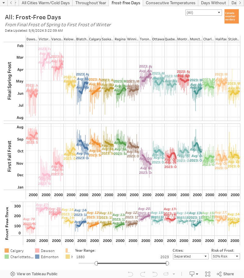
The final frost of the spring was quite late on May 6th, while the first frost of fall was also quite late on October 7th. So 2021 ended up with 139 frost-free days, which is just below the average of 142.
 

Edmonton versus Calgary
And finally, a quick comparison of Edmonton and Calgary. 2021 is interesting because of the two deepfreezes. Both of the cities temperatures plunged in February and December, but that's also where some of the largest daily gaps ocurred between the two.

That's the end of Part 1 of our 2021 Year-in-Review. Part 2 will look at temperatures in cities across Canada. In Part 3 we will talk about Precipitation. And Part 4 will be all about snow.

2021/01/01

2020 in Review - Part 2 - Temperatures Across Canada

In Part 1 of our 2020 review we took a detailed look at temperatures in Edmonton. In Part 2 we will be expanding that out to 8 other major cities across the country. Part 3 will be about 2020's Precipitation, and Part 4 will be Snow.


2020 Across Canada

In this chart each year since 2000 appears as a bubble. Orange bubbles were warmer than the 20th century average for the city, and blue bubbles were colder. The size of the bubble represents how warm or cold it was, and if you hover over them you will get a bit more information. These are calculated using the Mean temperatures (the average of the daily Highs and Lows), but with the dropdown on the lower right you can switch to look at the Highs or the Lows.

In 2020 all of the cities that we look at were warmer than their 20th century averages, with Edmonton at the cooler end of things:

  • Vancouver 0.7°C warmer than the 20th century average
  • Edmonton 1°C, Calgary 1.2°C, Regina 1.2°C, Winnipeg 1.1°C
  • Toronto 1.1°C, Ottawa 1.4°C, Montréal 1.9°C
  • St. John's 0.9°C

Something to notice here is that almost all of the bubbles in this chart are orange. This covers 21 years and 9 cities, and so there are a total of 189 bubbles here, and only 24 of them are blue. Since 2000 Winnipeg & Regina have each recorded 6 below-average years, Ottawa & St. John's have had 3, Toronto & Calgary 2, Montréal & Vancouver 1, and Edmonton none.

That is quite a change from how things used to be:

This chart has the yearly temperature bubbles for 20-year time periods, from 1880-1899 through 2000-2020.

2000-2020's 21 years had 24 blue bubbles across the country. 1980-1999 had 52, and 1960-1979 had 100. Way back in 1880-1899 there were 114 below-average years versus 29 above-average (some of the cities are missing data for those years, so the total number of bubbles is lower).

There have always been some years which were warm and others which were cold, but in the past 20~40 years the cold years have mostly disappeared for Canada's cities.


1841+

Here are all of the years of records together in context. 2020 was not a particularly warm year in Edmonton, with temperatures "only" 1°C warmer than the 20th century average. 

Vancouver was below that at 0.7°C, however Vancouver has a much more moderate (or less extreme) climate than Edmonton because of the ocean. So 0.7°C warmer than the 20th Century average in Vancouver ranks as #26 warmest, while 1°C warmer in Edmonton is #28.

So across the country 2020 ranged from #28 warmest in Edmonton, all the way up to #5 warmest for Montréal. So for all of the cities here 2020 was at least a top-30 year, and for Ottawa, St. John's, Toronto and Calgary it was a top-20.

The last time that all 9 of these cities had a top-30 year together was 2016, which was very warm: #3 warmest for Edmonton, Calgary & Regina, #4 for Winnipeg, #7 for Vancouver, #9 for Montréal...


Canadian Climate Stripes

This is another way of looking at that history all in one place, with the climate stripes for all of the cities. The prairie cities have been mostly in the reds since about 1980, while for the rest of the country it happened a little later around 2000.


2020 in Montréal

2020 was a top-5 warmest year in Montréal, and so we are going to take a closer look at what that means and where the number comes from.

This chart tracks how much warmer or colder each day of 2020 was compared to the 20th century average. Warm days get points and push the red line upward, and cold days drop the line down. It is split into Highs, and Lows because the Lows tend to have warmed up more than the Highs have. And then the average of Highs and Lows gives us the Mean, and the overall ranking of...

In Edmonton most of our warming comes from the Low temperatures. In 2020 Edmonton's Mean temperatures was 1°C warmer than the 20th Century average, but that comes from the Lows which were 1.42°C warmer and the Highs which were only 0.49°C warmer. And that pattern is typical, going back years.

Montréal is the opposite, with more of its warming coming from the Highs. In 2020 the Highs were 2.08°C above the 20th century average, while the Lows were only 1.79°C, which gives the 1.9°C total. And warming Highs are pretty typical for Montréal, happening in 2020, 2019, 2018, 2016, 2015...with 2017 as a rare year where the Lows had warmed more than the Highs.

Getting back to 2020, if we follow the red line along we can see that it climbs from January through April, and then takes a little bit of a dip. It then climbs again through September, and takes another little dip. And then it climbs through the end of the year.


Montréal's 2020 Highs

Here are what Montréal's daily High temperatures actually looked like. (just a note that the average line in this chart is the 30-year average, while the other charts today use that 20th century average as their baseline. Sorry about any confusion. This chart is more about the current picture rather than long-term trends)

This chart is a little cramped in this format, but in January-April we see a lot of red, with the temperatures only rarely dipping below 30-year average into the blues. April & May were cold, but then in late-May through July there were a bunch of new records. August, September & October all had a mix of above & below average days. And then there were a few more new records in November and December.

Montréal finished 2020 with 215 Highs above the 30-year average, and 151 below. That included 8 new records for warmest-High, and 1 for coldest-High. So even in a top-10 warmest year there are going to be some cold days.


Warm & Cold Months Across Canada

Here we have the monthly bubbles for all of the cities. Sticking with Montréal we see that January-March were warm, April-May were cool~ish, June-August were warm, September & October were cool, and November & December were warm.

On a month-by-month basis:

  • January was above-average across the country, but it was least-above average in Edmonton & Calgary.
  • Things flipped for February, with Edmonton, Calgary and Regina well above average, while the rest of the country was just a bit above average.
  • Edmonton & Calgary got an extra-cool March, while on the coasts Vancouver and St. John's were a little cool, and the rest of warm.
  • April was cool from coast-to-coast, and especially in Edmonton & Regina.
  • May was pretty middling, with Vancouver a little warm and Toronto a little cold.
  • June was pretty warm from Winnipeg through St. John's.
  • July was really warm in Ontario & Quebec, meh in the west, and cold in St. John's.
  • In August things flipped, with Edmonton, Calgary & St. John's the most above average.
  • That continued into September, with Edmonton, Calgary, St. John's & Vancouver warm, and Winnipeg through Montréal cool.
  • October was really cold on the prairies, meh in central Canada, and warm in St. John.s
  • November was pretty warm everywhere except Edmonton.
  • And finally, December was warm across the country, and especially across the prairies.
With all of that, that is how each of these Canadian cities ended up with a 2020 that was warmer than their 20th century average temperatures. 


And that brings us to the end of Part 2 of our look back at 2020. In Part 1 we looked at Edmonton's Temperatures. Part 3 will be about Precipitation, and Part 4 will be Snow.

2020 in Review - Part 1 - Edmonton Temperatures

Today we are taking a look back to see how Edmonton's 2020 temperatures compared to other years. In Part 2 we will expand that to cities across Canada. Part 3 will be about 2020's Precipitation, and we will close things out in Part 4 with a look at snow.


Warmest & Coldest Years

We'll get the big news out of the way: Edmonton's average temperature for 2020 was the 28th warmest overall, at 1°C warmer than the 20th Century average. That's warmer than 2019 (#56) and 2018 (#36), but below 2017 (#15), 2016 (#3) and 2015 (#4)

9 months were warmer than their 20th Century averages, including December at 6°C warmer than average and February at 4.3°C. The 3 cooler months were March, April & October, with October -2.5°C cooler than its average.


For the Climate Stripes chart that makes 2020 a light pink. It is darker than 2019 at 0.4°C, but much lighter than 2016 at 2.9°C

The last time that we had a blue stripe was back in 1996, at -1.7°C colder than the 20th century average.


The Horserace

This chart shows where the "28th warmest year" calculation comes from. 

It tracks how much warmer or colder each day of 2020 was compared to the 20th century average. Warm days get points and push the red line upward, and cold days drop the line down. It is split into Highs, and Lows because the Lows tend to have warmed up more than the Highs have. And then the average of Highs & Lows gives us the Mean.

Following the line for the Highs:

  • in January it climbed and then dropped
  • it climbed in February and into March
  • it dropped in late-March and into April
  • it was basically flat for May all the way through September
  • in October it climbed a bit, and then dropped a bit again
  • it climbed through most of December.

The Lows look pretty similar, except that they slowly a bit during the summer.

So at the end of the year the Highs ended up at 0.49°C warmer than the 20th Century average, for our 49th warmest Highs. And meanwhile the Lows were 1.42°C warmer for 24th warmest Lows. The average of the two gives us 2020's total of 0.96°C above the 20th century average, and 28th spot.


Warm & Cold Months

In this chart each month since 2000 appears as a bubble. Orange bubbles were warmer than the 20th century average, and blue bubbles were colder. The size of the bubble represents how warm or cold it was, and if you hover over them you will get a bit more information. Here we are back to using the Mean temperatures, but with the dropdown on the lower right you can switch to look at the Highs or the Lows.

2020 was 1°C warmer than the 20th century average, and the bubbles here give us a way to compare the various months:
  • January was warmer than the 20th century average, but most recent Januarys have been "warm." 2020 was actually the coldest January that we had had since 2004.
  • February was fairly warm, and was very different from the giant blue bubble for the very cold February of 2019.
  • March & April were both below average. But a cold March & April together happens fairly frequently: 2018, 2017, 2014, 2013, 2011... 
  • May through September were all warmer than the 20th century average, but not by much. And if you switch this chart to show the Highs, May through July were all basically right on the 20th century average, so it was the Lows which made up the difference.
  • October was quite cold, and the last time that we had a "warm" October was 2015.
  • November was right on the 20th century average.
  • December was quite warm, although not quite as warm as 2011.


High Temperatures

This chart is a little cramped, but it has the daily High temperature rollercoaster for the whole year. During the year our temperatures don't spend much time right around the average, and instead bounce back and forth between warm days and cold days.

In particular here we can see the coldsnaps that we had in mid-January, early-April and late-October with the temperatures right down at the bottom of the 30-year range. Overall there were 197 days above the 30-year average and 168 below.


For "warm" days 2020 ended up with 100 days which hit 20°C. That was up from the 82 we had in 2019, but down just a bit from warm years like 2015-2018.

For warmer days, 2020 had 23 Highs which hit 25°C, and that's down from the average of about 40. And 2020 had 2 days hit 30°C, when we average around 6 or 7.


Low Temperatures

And here are the daily Low temperatures for 2020.

The coldsnaps in January, February, March, April and October all stand out. And those included two notable days:

  • On January 15, 2020 we hit -37.6°C. That was the first time that Blatchford had broken -35°C since December 13, 2009, and the first -37°C since January 19, 1996. The last time that Blatchford hit -38°C was also the last time that it hit -40°C, back in January 1972.
  • On April 2nd the Low was -20.8°C. That was the first time we had hit -20°C in April since April 3, 1982.


Looking at the cold days, 2020 had 19 days with Lows which hit -20°C, which is close to the average. That included 9 Lows which hit -25°C, which is also right on the average. And each year we average about 2 Lows at -30°C, and 2020 recorded 4 including the ridiculous -37.6°C.


Frost-Free Days

Edmonton's final frost of the spring of 2020 was quite early, on April 19th. The average is around May 6th. The first frost of fall was also a little late on October 9th, compared to an average of around September 25th.

The early final spring frost and late first fall frost meant that 2020 had 173 frost-free days, which is about a month longer than the average of 142. In recent years 2011 had 174 frost-free days, and 1980 was the longest with 185.


Edmonton versus Calgary

And finally, just for fun here is a comparison of the daily temperatures in Edmonton & Calgary for 2020. Generally the two cities move together, although sometimes some big gaps open up.

The largest difference was on January 19th with Edmonton's High at -16.5°C, while Calgary was 21.4°C warmer at 4.9°C. That was that was the start of a warming trend that reached Calgary first, and Edmonton was above freezing by the 21st. The largest difference in Lows was in that same gap on January 20th with Edmonton at -17.6°C and Calgary 13.5°C warmer at -4.1°C.

In the charts there's a thin line (it's a little tough to see) which shows the average difference each week. During the winter Calgary's Highs average about 4~5°C warmer than Edmonton's, while the Lows are a little bit closer at 2~3°C warmer. In the summer Edmonton's Lows are usually 1~2°C warmer that Calgary's, while the Highs are a bit of a mix.


With that we have reached the end of Part 1 of our review of 2020. In Part 2 we will look at temperatures in some of the major cities across Canada. Part 3 will be about a Precipitation. And we will end things off in Part 4 with a look at snow.

2018/01/02

2017 in Review - Temperatures

Today is Part 1 of Edmonton Weather Nerdery's 2017 Year-in-Review, and we'll be looking at the year's temperatures. In Part 2 we'll focus on precipitation.

The charts today are all ones that have been used in the past, and since some of them can be complicated there will be links back to the original posts that have full explanations.

High Temperatures

Here we have the High temperatures for the year.

The colourful stuff in the background of this chart is the range of temperatures that have been recorded since 1996. The average high for each day is the white line in the centre; it is surrounded by a grey band for the 25th-75th percentiles (where temperatures will fall roughly half of the time); and outside of that are the warmest temperatures since 1996 in orange and the coldest in blue. And finally, the all-time warmest and coldest temperatures going back to 1880 are shown as the faint lines that are furthest from the average.

In 2017 we set four all-time records for warmest-High - on February 15, May 5, September 7 and September 11. If breaking 4 all-time records in one year sounds like a lot, we looked at that earlier this year in How Often Does Edmonton Break Temperature Records?

In addition to the all-time records, the orange dots in this chart also show warmest-since-1996 records, and there were 22 more of those. We didn't set any all-time records for coldest-Low (that doesn't happen very often), but we did set 15 coldest-since-1996 records which are shown by the blue diamonds. 3 of those were during the late-December deepfreeze, 5 were during the early-November coldsnap, and the rest were scattered throughout the year.

The Red & Blue highlighting in this chart shows days that were above or below average. With that we can see the many swings from coldsnap-to-heatwave (or visa versa) that happened in January, February, March, May, September, November and December.

Low Temperatures

Here we have the Low temperatures.

2017 set 6 all-time records for warmest-Lows, on May 5, June 8, August 21, August 28, September 8 and September 27. In addition to that there were 22 other warmest-since-1996 Lows, and 13 coldest-since-1996 Lows. 3 of those coldest-since-1996 Lows were between Christmas and New Year's, and 5 were in early-November.

How Normal is Average?

Looking at 2017's temperatures you might think that they bounced around from warmspells to coldsnaps, without much time spent at the average. And that's pretty typical.

This chart cycles through the High temperatures for the last 5 years, and we can see that every year spends a lot of time near the extremes. We looked at this in detail earlier this year in How Normal is Average? and saw that about 58% of the time we're within ±5°C of the average.

The Horserace

So how does 2017 compare to other recent years?

For a full explanation of this chart it's easiest to refer back to the original discussion of it in How warm is 2016? (September Edition). Generally though, it tracks how much warmer each day of the year was compared to the 20th century average - warm days get points and cold days lose them.

The blue and orange background is the range of all the years going back to 1880, and they are grouped together like that because showing each individual year gets too messy. To keep things simple the last 10 years are shown here as a reference.

So how warm was 2017? Using this metric it was Edmonton's 16th warmest-ever year. Recently 2015 and 2016 were both very warm, in 3rd and 4th spots respectively. 2017 falls well below them, but above every other year since 2007.

When we follow the red line we can sortof see all of the warmspells and coldsnaps: a bumpy January through May; a fairly steady climb through to September; a major dip for the unseasonably cold early-November; a climb back up during our December chinook; and then one final drop for the end-of-December deepfreeze.

Warm & Cold Months

Here we have one more summary of how 2017 breaks down, this time on a monthly basis. The full explanation of this chart was in How Warm is 2017 - the Months.

January was our most above-average month, at 5.4°C above the 20th century average. That's partly just luck though, because January started out a little cool, before finishing off warm, including 8 days above 5°C.

I say that January is lucky because many other months - February, March, November and December - also had heatwaves, but they were balanced-off by deepfreezes, and so when we look at the month as a whole the numbers are more moderate. December is still fresh in our minds, and the first 2 weeks were extremely warm, while the last week was very cold, and together those put December at 3°C above the 20th century average.

Warm & Cold Years

And all of that adds up to this chart, which is the full list of Edmonton's warmest and coldest years.

The explanation for this chart is in Edmonton's Warmest Years, but it is essentially averages all the temperatures for an entire year, and then compares that to the average for the 20th century. The reason I've used the 20th century average in several of the charts today is because this chart is based on one from the National Oceanic and Atmospheric Administration, and they use the 20th century average as their baseline.

2017 is in 16th place, overall and was 1.6°C warmer than the 20th century average. 2015 & 2016 were both warm El Niño years at 2.5°C and 2.9°C respectively, so 2017 is down from there. But it's just a bit below 9th and 10th place 2006 and 2005 at 1.9°C and 1.7°C, and 1999 was just a touch above it in 15th place.

This chart also shows the 5-year average, which really shot up in the mid-1970s and has stayed high ever since.

Really Cold Days

In terms of really cold days, 2017 had:
  • 23 days with Low temperatures of -20°C or below (8 were in the last week of December)
  • 11 at -25°C or lower (6 were in December)
  • 2 at -30°C or lower (both in December)
2017 had more cold days than 2015 and 2016, which were both affected by a warm El Niño. The dotted red line in this chart is the 5-Year average, and compared to that (and to the "typical" years of 2008~2014) 2017's cold days were pretty much what we would expect.

And that's it for the 2017 Year-in-Review Part 1. Later this week in Part 2 we'll look at 2017's Precipitation.

2017/03/20

Edmonton's Warmest & Coldest Winters

Today is officially the first day of spring, although we'll probably still have snow for a few more weeks yet.

But with the winter of 2016-2017 nearing its end, was it a warm one, a cold one, or pretty typical? I remember lots of coldsnaps and warmspells, but I don't have a great sense of how this winter compared to others. So today we're going to try to find out.

Temperatures for Winter 2016-2017

"Spring" technically starts today, March 20th, and "Winter" technically started on December 21st. But because the Canadian prairies take a slightly more relaxed approach to the seasons, here is a reminder of our temperatures going back to November:
  • November started very warm, with a few all-time records. And things stayed fairly warm through the end of the month.
  • December started with a long coldsnap, and after that the temperature jumped around.
  • January also started with a long coldsnap, followed by some very warm days and recent-records.
  • February also started with a coldsnap and a few recent-coldest days. That was followed by some very warm days, including an all-time record.
  • And March also started with a coldsnap, before warming up recently.

So we've had a lot of ups-and-downs, which isn't particularly usual. But how does this winter compare to others?

Warmest and Coldest Winters

This chart is a variation of one that I used last year in Edmonton's warmest years (or NOAA anomalies, NOAA problems), except this one is only looking at the months from November through March. If you're interested the details behind the chart it's probably easiest to go back to the original post.

But generally, this compares the temperatures for each winter to the 20th century average. Warm winters are in orange, and cold ones are in blue. Using this approach, Edmonton's warmest-ever winter was last year, and it was on-average 5°C warmer than the average for the 20th century.

2nd and 3rd place are a bit of a surprise, coming in as 1930-1931 and 1888-1889 respectively. But we have seen both of those years show up unexpectedly before - the winter of 1930-1931 had only a single day below -20°C; and 1889 was Edmonton's 8th-warmest year on record, even though it was more than a century ago.

2016-2017 is dashed-in on the right, because this chart is counting all the way to the end of March. Right now 2017 is sitting at about 2.5°C above the 20th century average, which is pretty much inline with the winter of 2014-2015 two years ago.

Lets take a closer look at the breakdown for each winter:

The Horserace

This chart is a variation of one that I used last year in How Warm is 2016? And for all of the details behind it, again it's probably easiest to go back to the original post.

The short version is that this tracks how warm or cold things were, on a day-to-day basis. Days that are warmer than the 20th century average for that date gain points, and colder days lose them. With this chart, if I show all 130+ winters it's an unreadable mess. So here we just have the recent winters going back to 2006-2007, and the colourful sections in the background show the historic ranges.

Looking at the redline for 2016-2017 we can see:
  • very warm and above-average November
  • colder-than-average early-December
  • fairly-average flat section from December through January
  • chinooks in late-January and mid-February
  • colder-than-average early-March

And here when I talk about the "average" that isn't just recent years, but is looking at the entire 20th century from 1901-2000.

As of late-March then, the winter of 2016-2017 is roughly tied with 2009-2010 and 2014-2015, ranking as Edmonton's 25th~ish warmest recorded winter. In terms of recent years, that makes this a fairly warm winter, with the only significantly warmer ones being 2015-2016 in 1st place overall, and 2011-2012 in 6th place.

That also means that 6-of-the-last-10 winters were colder than this year, with 2010-2011 and 2013-2014 both coming in below the 20th century average.

5 Warmest Winters

Here's a look at the 5 warmest winters of all-time, with 2016-2017 included as a reference. Our very warm November had us in 1st place for a little bit, but that tapered out by mid-November.

The Top-5 are all really close to one another, although they took different paths to get there:
  • 2015-2016 (in orange) followed a slow-and-steady path to the top spot.
  • 1930-1931 (in green) was out to a huge lead at the end of February, but then a cold March dropped it down into 2nd.
  • 1888-1889 (in dark red) started quite slow, but had huge gains in January and February to reach 3rd. 
  • 1976-1977 (in turquoise) also had a slow start, before taking off in late-January to finish in 4th. 
  • 1987-1988 (light blue) had a very warm start in November and December, before some drops in early January and early February.

One thing that we can see from this chart, is that the overall ranking depends on exactly which dates we choose. 1930-1931 was in first place right up until the final week of March. And so if we want to say that winter officially ends around March 20, then maybe 1930-1931 was truly Edmonton's warmest winter?

I'm not going to get too hung up on that though, because I think the definition of winter needs to be a bit more fluid in this part of the world. But it does bring up another question, which is when exactly does winter start?

October, November, or December?

This is the same chart  that we were looking at earlier which shows the last 10 winters, except here the starting point changes from October 1st, to November 1st (which we've already seen), to December 1st. Because this whole thing is cumulative, the final results depend on what day we choose to start from.

We've already looked at what happens when we start counting in November, and in that case 2016-2017 is about the 25th warmest winter. But we know that November was really warm, and that gives this winter a pretty big boost.

If we use December 1st as the beginning of our winter instead, then we're almost immediately into the negatives, because December was pretty cold. From there 2016-2017 doesn't hit the average again until the chinooks of late-January. And as of late-May it's roughly tied with 2007-2008, 2009-2010, and 2012-2013 for a ranking of about 40th-warmest winter.

If we use October 1st as the start of our winter, we are also immediately into the negatives, because last October was really cold. That gets offset by the warm November, and by late-May we're in roughly 40th spot again, and tied with 2007-2008 and 2009-2010 again.

So all of that is just a long way of saying that none of this is written in stone. Looking at the last 10 winters, depending on exactly how you count 2016-2017 would fall somewhere between typical and warmish.

I think November 1st makes the most sense as the unofficial start of our winter. With the switch from Daylight-Savings time it now makes a really distinct break from October. Even without the time change though, November is the point where snow starts to stick around. Winters with snow in early-November feel very different from the ones when we are snowfree until late-November or early-December. So I definitely think the heatwave of November 2016 is important to count here, because it was certainly a notable part of this winter.

And personally, I don't actually consider the winter to be over yet. The charts today are really just preparation for a full Winter 2016-2017 report card that I'll do in maybe mid-April. At that point we'll revisit this, but will also look at warm days, cold days, snowfall, and etc.

2016/09/07

How warm is 2016? (September Edition)

A few weeks ago I looked at Edmonton's warmest and coldest years, relative to the average temperatures for the 20th century:


I couldn't include 2016 in that comparison because there are still several months left, and that wouldn't have been fair.

But today we'll be looking at each year on a day-to-day basis, so we can see exactly how 2016 stacks up against all the rest.

There is a tonne of data today, and I'm struggling a bit with how exactly to present it, so we're going to take things in steps.

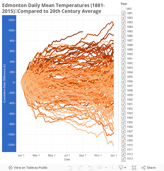
To start things off, here's the whole mess of data:


The thing to take from this chart, is that 2016 is warm. It's the orange line that is above the rest of the giant mess.

Beyond that though, this is basically impossible to read. What it is trying to show is how each year from 1881-2016 varied from the 20th century average, on a day-to-day basis.

To clean things up a bit, here is the same data condensed into Highs/Lows/Quartiles, with 2015 shown as a reference:


I hope that gives a bit of a clearer idea of what's going on.

For both 2016 and 2015 the first few weeks of January were actually pretty cold: a little above the 20th century average for 2016, and actually a bit below that for 2015. But by late January both years had picked up and were above the 75th percentile (although just as a reminder, this is a comparison to 136 years, and not just to recent history). By the time we'd reach April, 2016 was the warmest year ever recorded, while 2015 climbed pretty steadily for the whole year.

As of August 31 the score for 2016 is 978°C, and for all of 2015 the total score was 914°C. What do those numbers mean? Unfortunately they're pretty abstract, and aren't actually anything that you can feel. Here is an explanation of where they come from, using 2015 as an example:

The top section of this chart shows the 20th century average temperature for each day of the year, as well as the actual temperature that was recorded in 2015. Oranges are days when 2015 was warmer than the 20th century average, and blues are cooler.

The bottom section is a running total of all of those differences for the year. So if today's weather report says that it was 20°C today, but the average for this time of year is only 15°C, then that would be a difference of 5°C. (with a note that this uses the mean temperature for the day, rather than the daily high or low, but the general idea is the same). The combination of all of those daily differences gives us the total score of 914°C for 2015.

So a score of 978°C for the first 8 months of 2016 isn't something that you can feel, but as a way to calculate a running-total for each year it seems to make sense.

For a little bit more context, here is 2016 compared to the last 10 years:


With this we can see that 2015 is quite a bit higher than the others. 2006 and 2005 are in 8th and 9th place overall, with totals around 600°C, compared to 2015's 914°C which is in 3rd spot. And the coolest year was 2009 in 68th place, which actually stayed quite close to the 20th century average for the whole year.

While all of the last 10 years ended up above the 20th century average, it's maybe a little interesting that 4 of them didn't break the 75th percentile range. Looking at 136 years of data I'd have expected recent years to be really high, but a year like 2009 is right in the middle of the pack.

Here are the day-to-day timelines for the top 10 years (2015, 2006 and 2005 were in the previous graph, as well as in this one):


It's a little bit tough to read because they're all grouped quite tightly, but 1981 and 1987 in 1st and 2nd spots have a respectable gap over all the rest. And buried right in the middle of that is the mysterious 1889 in 7th place.

Digging into things just a little bit more, here is 2016 compared to the previous top 3 - 1981, 1987 and 2015.


Again we see that January 2016 was pretty boring, but after that things really took off. 2016 started challenging for 1st place in early March, and by April it was well in the lead.

Looking at the summers, even though this year didn't seem particularly warm, we can see that 2016 basically kept pace with the other years - 1981 and 1987 both actually dropped off a bit in June-August compared to 2015 and 2016. But then both 1981 and 1987 really took off again in October.

There are still 4 months left in 2016, so where are we likely to end up?


Here is the September through December graph for the last 10 years, to give an idea of what is "typical" for fall and early winter.

Getting back to the idea of "points", for September through December the average for the last 10 years is a score of 84. 2011 had the warmest final 4 months with 370 points, and 2012 was the coldest with -220.

This next chart takes those recent histories, and adds them onto the end of 2016:


Here the light grey lines show what recent falls have looked like.

As of August 31, 2016 is at 978. The end-of-year scores for the 3 previous warmest years are 1981 with 1,109; 1987 with 1,099; and 2015 with 914.

So if this fall is "average" then 2016 will end up at around 1,060 points, putting it 3rd overall behind 1981 and 1987. To claim 1st we would need 131 points, which has happened 4 times in the last 10 years - 2005, 2011, 2014 and 2015.

A chilly fall like 2010 or 2013 could drop 2016 down to about the same level as 2015, for a battle for 3rd and 4th spots. And if we have a really cold fall like we did in 2012, then that could push 2016's total down to about 5th overall.

That's all just speculation though. Another way of viewing this is to ignore calendar years, and to just look at the last 12 months instead:


Here the chart is shifted to show September-August, rather than January-December. And in that timeframe, the last 12 months have been the warmest ever recorded in Edmonton.

One thing that's interesting about this though, is that 2011-2012 and 2005-2006 come in as the previous 2nd and 3rd highest, even though those individual calendar years weren't particularly warm.

Here's the reason behind that:


2005 was a pretty unexceptional year, until a warm fall moved it into 9th place. And then 2006 was a very warm year, until a cool fall dropped it into 8th place. So individually they are at the bottom of the top 10, but together September 2005-August 2006 ranked 3rd.

2011-2012 are similar. 2011 was actually a very cold spring and summer, but a warm fall boosted it from below average to above the 75th percentile. And then 2012 was very warm - almost as warm as 2006 - until the very cool fall pushed it down to 19th place. But September 2011-August 2006 together ranked 2nd warmest.

So with all of that then, the last 12 months were the warmest September-August ever recorded. But our recent super El Niño is over, so we'll have to wait and see what fall 2016 brings.

Finally today, because there's so much data that I'm trying something new. Here is an interactive chart which will let you view the various years: