Showing posts with label Tyranny of Averages. Show all posts

2025/11/18

Edmonton's Winters - the Good, the Bad, and the Data (Part 1)

Whether you're a newcomer to Edmonton, or an oldtimer, today we hope to shed a little light on our darkest season with a little something called: Edmonton's Winters - the Good, the Bad, and the Data (Part 1).

(if you're reading this from the future, the dashboards in these big posts tend to break pretty easily.
 so an archive of the original images can be found on bluesky or mastodon.)  
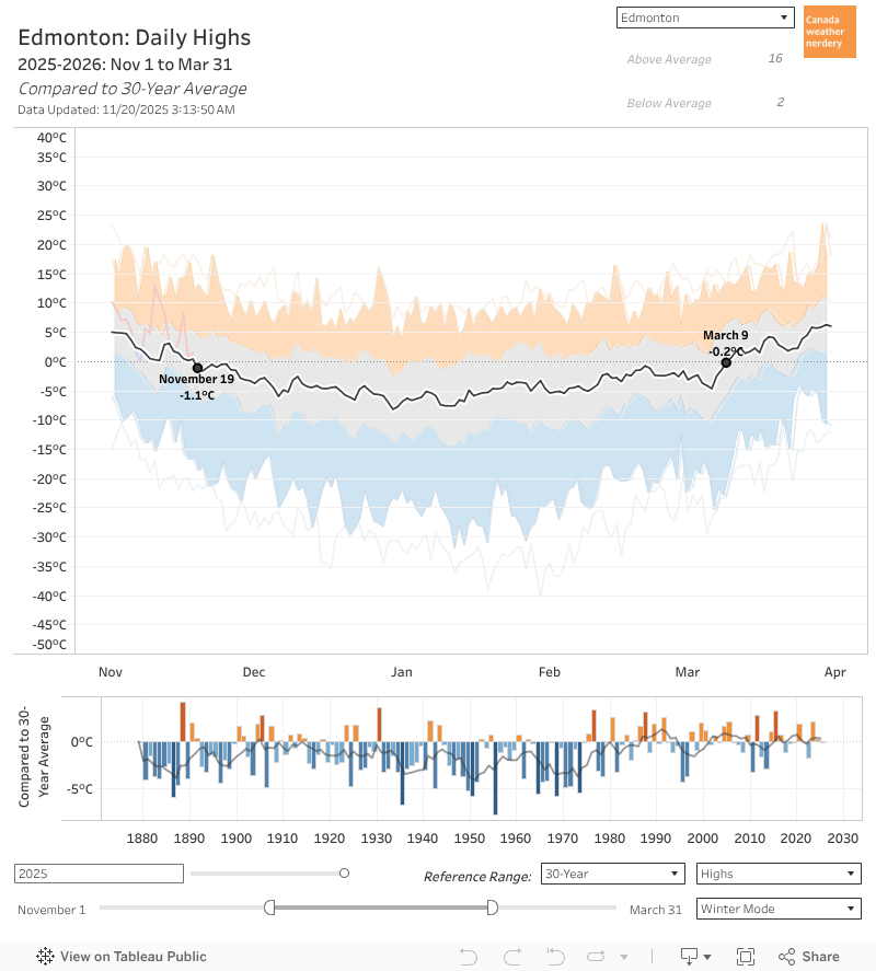
November 19th is the first day of the winter when our average High drops below Freezing.
And it will stay down there until March 9th. 

That's 110 days.

Ooof.


Average Highs
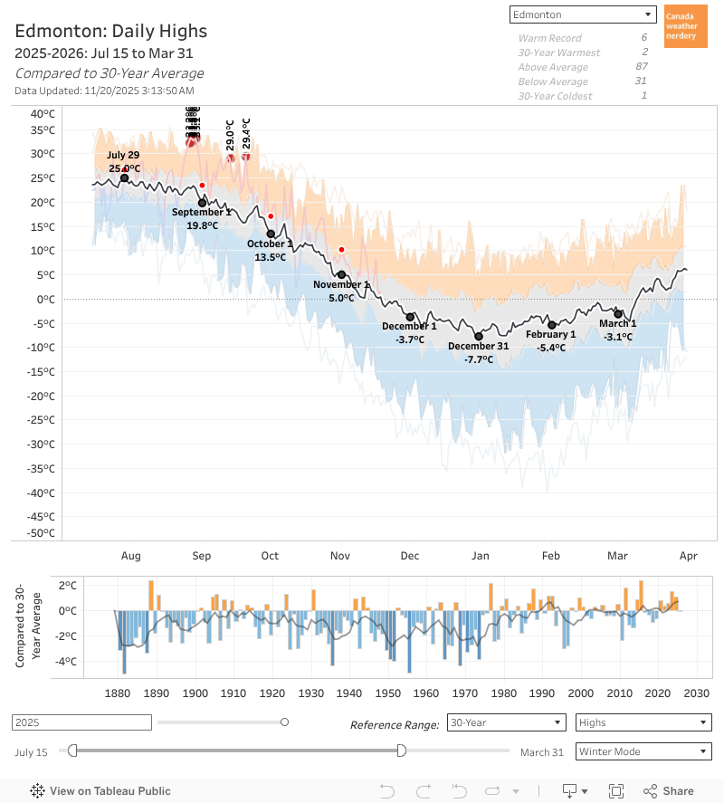
Our average High bottoms-out right around New Year's at -8°C, but that only lasts for around a week. 

For most of December-February our average is more like -5°C. 

Since July we've already dropped from 25°C to 0°C, so at this point we're already most of the way there.


Average Lows
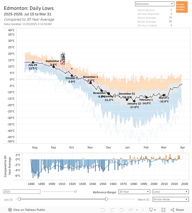
Our average Lows follow a similar path, although they bottom out in mid-January at -17°C, down from a peak of 13°C in July.

For most of December-February the average is around -14°C, and right now in the middle of November the average is still at around -9°C.


Calgary
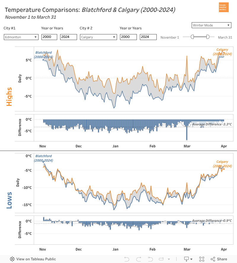
Compared to our friends down south, the overall shapes here look pretty similar, with average temperatures being fairly flat for most of December-February.

But Edmonton's average winter Highs are typically around 5°C colder than Calgary's, and the Lows are 2°C colder.


Canada
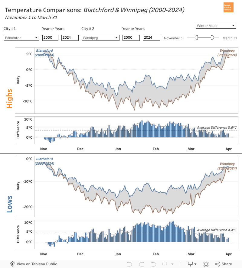
Other winter cities (Winnipeg, Ottawa, Montréal, and let's say Halifax) look a little different. 

Edmonton's temperatures really flatten around New Year's, whereas it's more typical for temperatures to keep dropping until late-January.

Why is Edmonton (and Calgary) weird?


Warming
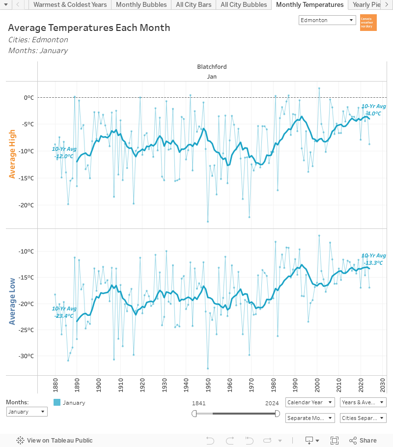
It will be hard to believe this once we're stuck in the middle of a deepfreeze, but Edmonton has seen phenomenal warming during January.

January's average temperatures are 8-10°C warmer than they were in the early 1970s.
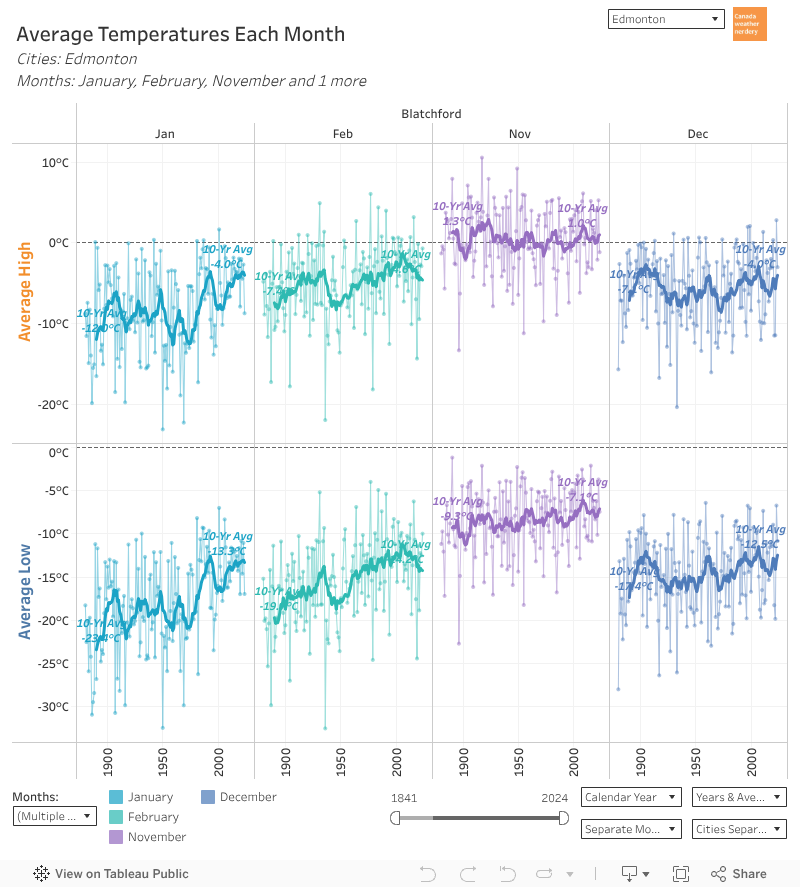
And that warming is really specific to January, with a bit in February. 

Over 140+ years November's temperatures are fairly flat (slightly warmer Lows). And December has warmed up a bit more than November. But January is up by 8~10°C, and February is up by 3~5°C.
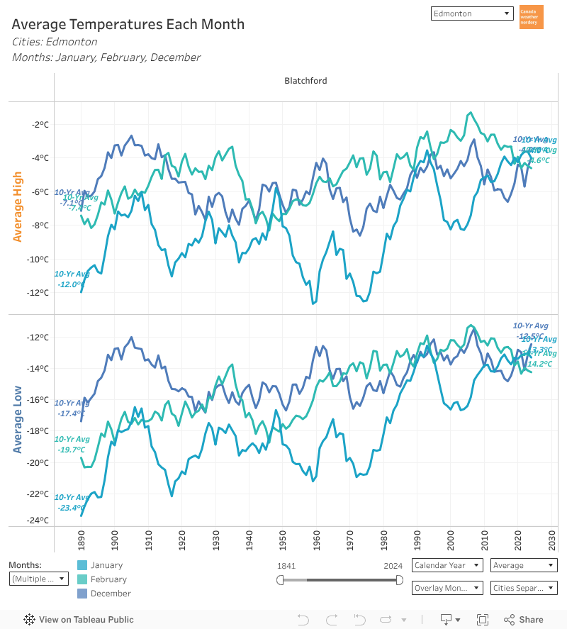
For most of recorded history, January was our coldest month by far.

But since 2010~2020 the average temperatures for December, January & February have all been really close.
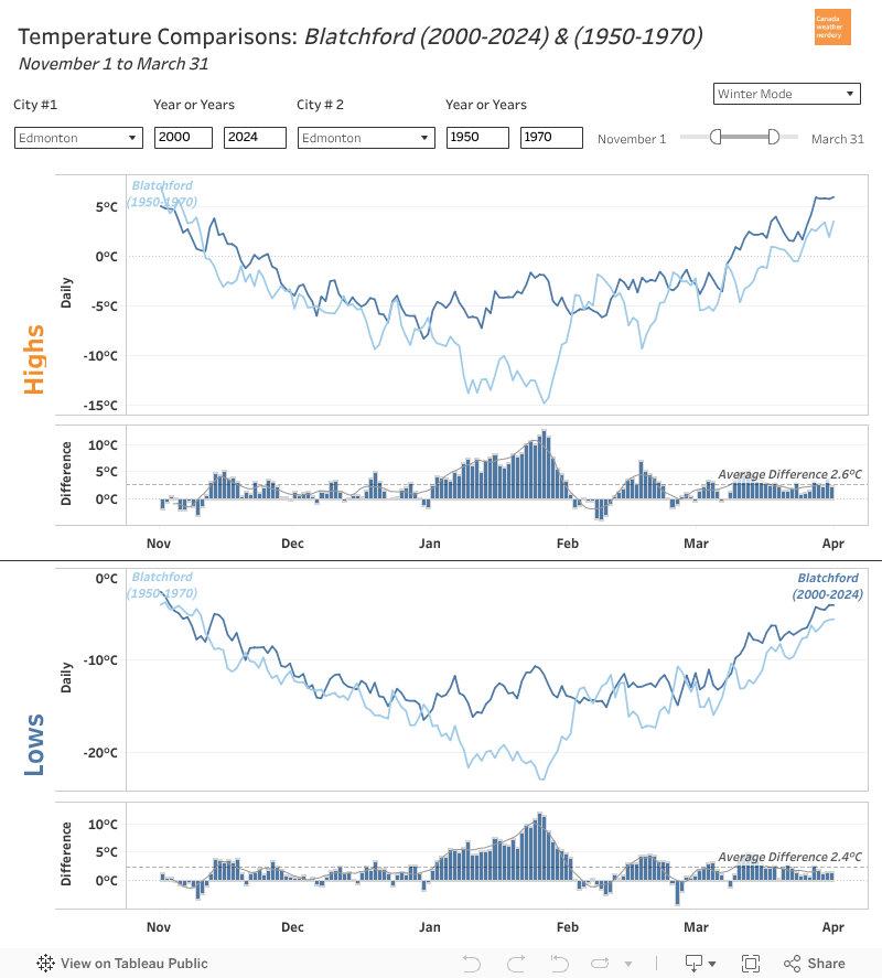
So if you compare the average temperatures for a modern winter to 1880-1900, or even to 1950-1970, there's now a giant chunk of extreme cold missing from January.

Once upon a time our temperatures continued dropping until late-January, but that's gone now.
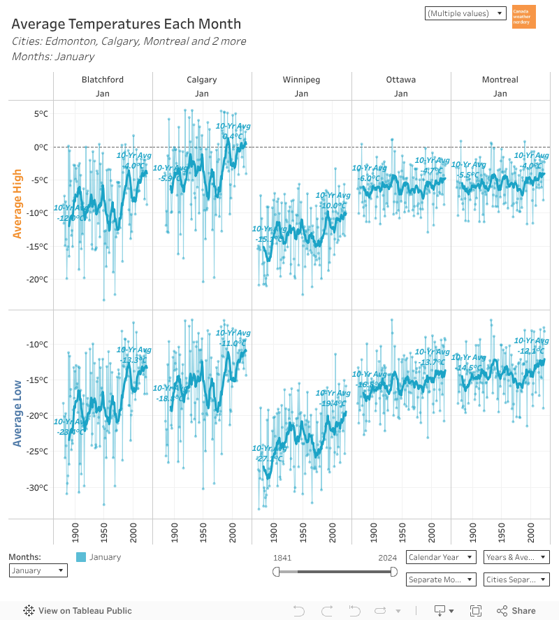
Other winter cities have also seen some January warming, but it's the largest by far in Edmonton & Calgary.
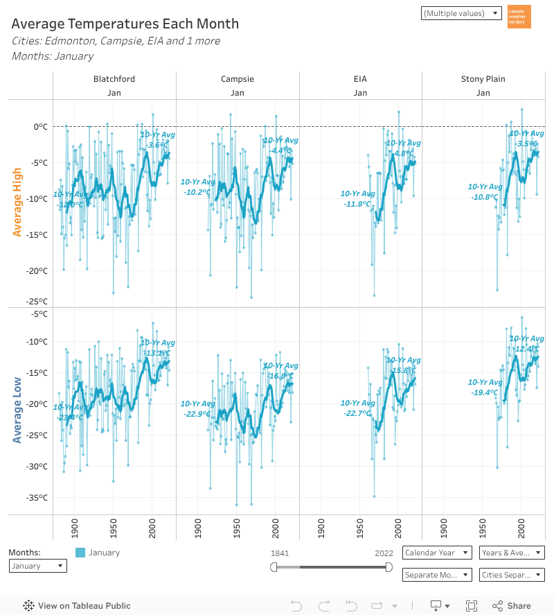
And the outlying stations around Edmonton have also seen big January jumps, even if their histories are shorter.
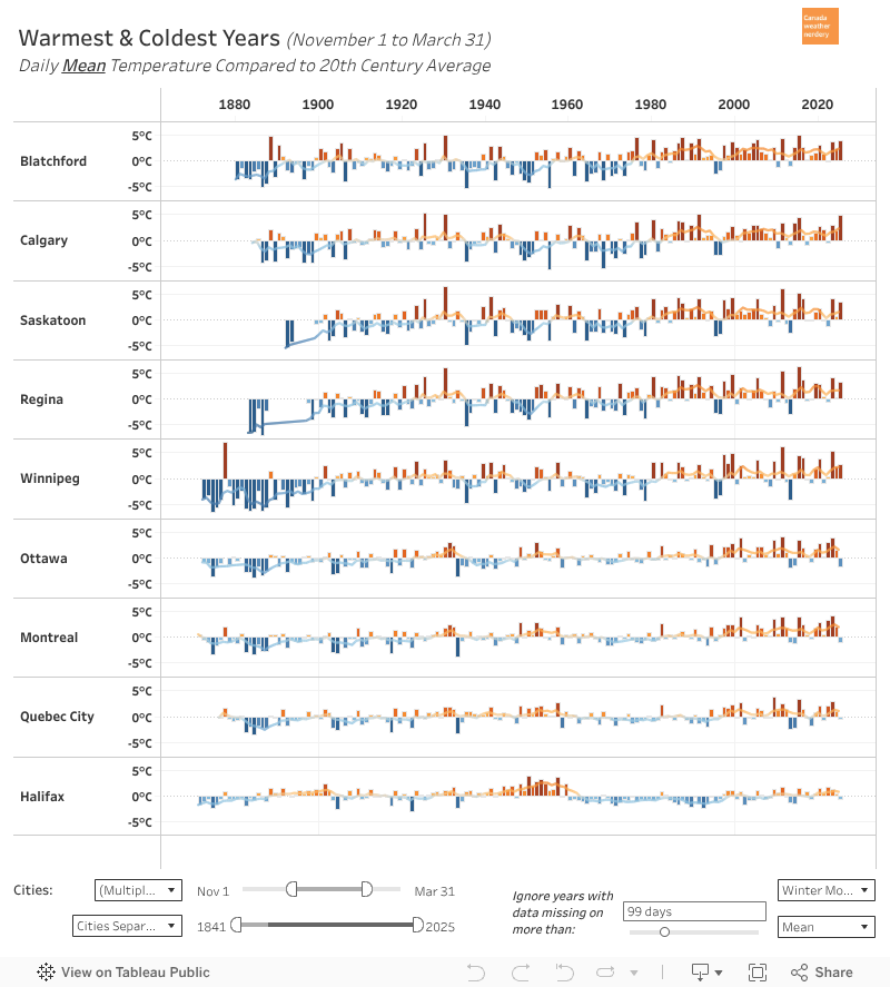
For a full historic perspective, this is how temperatures for each November-March compare to the 20th century average.

Since around 1980 most winters have been above average, sometimes by 4 or 5°C. On the prairies the few big exceptions were 1995, 1996, 2010 & 2013.


Extreme Cold

In a typical winter we average around 25 Lows of -20°C. So not quite a month of deepfreeze, typically spread somewhere between mid-November and mid-March.

That's down from 40-50 days historically, although recently 2010-2011 got to 48 of them, and 1995-1996 got to 52.

In those deepfreezes we average around 12 -25°C Lows (down from 25 historically), and 4 -30°C Lows (down from 12).

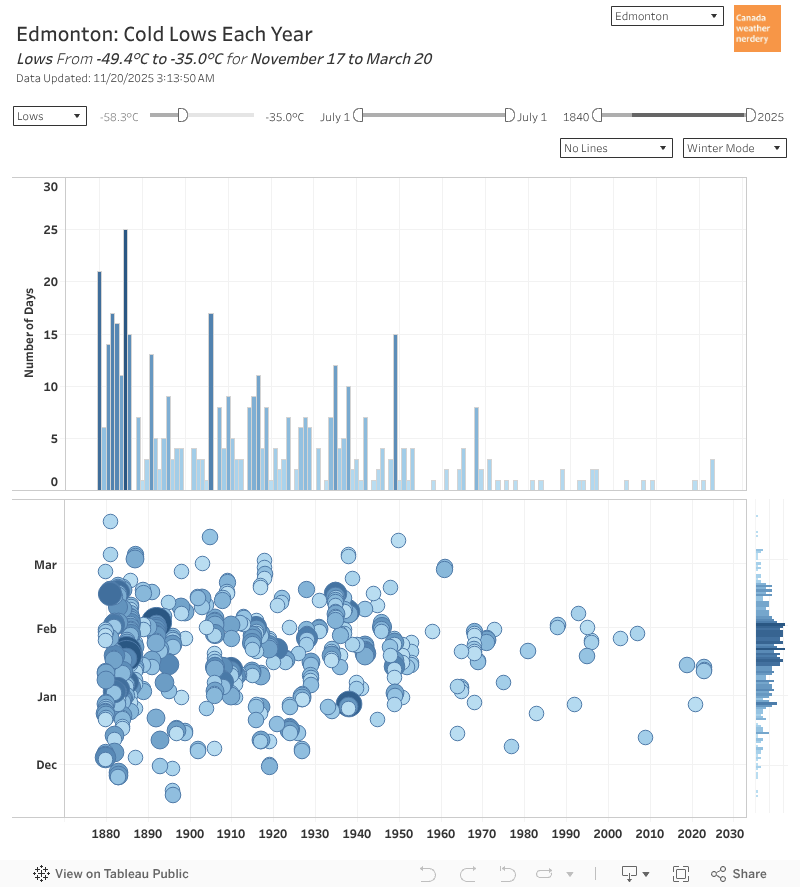
-35°C is pretty uncommon nowadays (we went from 2019 to 2020 without getting any), but then we got there in 2020, 2021, and January 2024 had 3 of them.
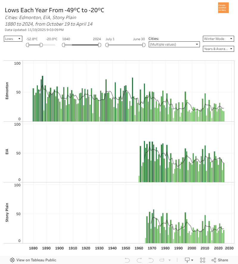
Our airport and the city are not the same.

The airport is very cold, even compared to other outlying stations. Edmonton & Stony Plain average ~25 -20°C Lows, while the airport is around 40. For -30°C Lows it's ~4 compared to 12. So, don't live at the airport.
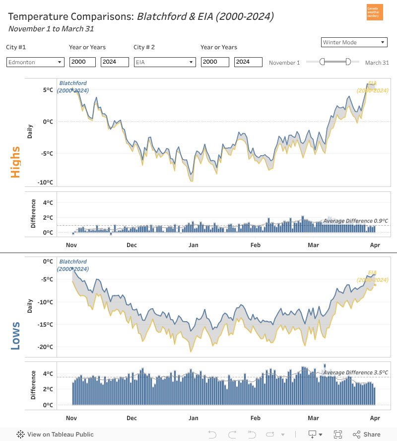
The airport's average winter Lows are 3.5°C colder than the City and Stony Plain, and almost 2°C colder that Villeneuve. Making a trip to the airport is in some ways like making a trip to Winnipeg.
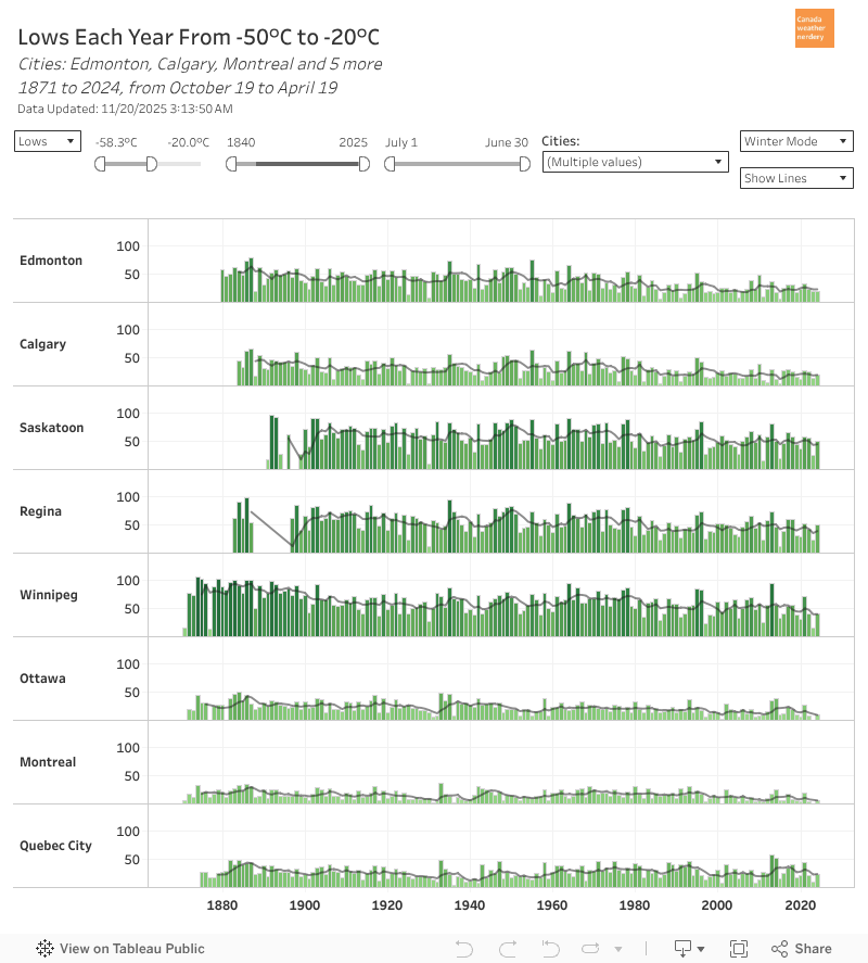
Speaking of Winnipeg... 

For -20°C Lows:
  • Winnipeg, Saskatoon & Regina average around 50
  • Quebec City, Edmonton & Calgary are mid-20s
  • Montréal & Ottawa get a dozen. 

For -30°C Lows:
  • a dozen for Winnipeg, Saskatoon & Regina
  • ~3 for Quebec City, Edmonton & Calgary.


Deepfreezes
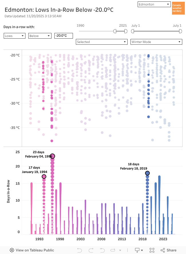
So in a winter we get around ~25 Lows of -20°C. From 1998~2018 that usually meant a few weeklong deepfreezes each winter, plus some stragglers. But 2019 gave us our longest deepfreeze in a generation. And since then we've had a bunch of other notable ones.

Last year we did a big look at our recent deepfreezes, and how they compare to history:


(tl;dr: since 2019 we've had an unusual number of extreme deepfreezes which wouldn't have been out of place in the 1970s, but which are pretty weird today. Blame the broken jetstream.)


Winter "heat"
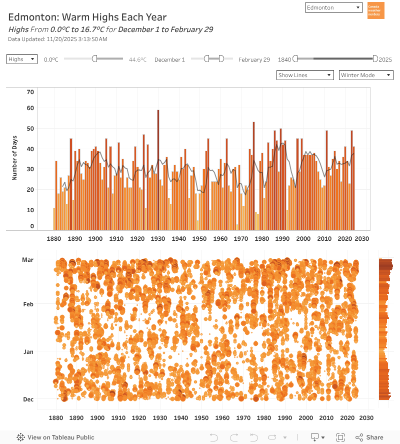
But Edmonton winters are not all deepfreezes.

In the deepest winter months of Dec-Feb we average around 35 above-freezing Highs (so around 40% of the winter days).

And that includes around 15 Highs which get to 5°C.

And those numbers haven't changed too much over the years.
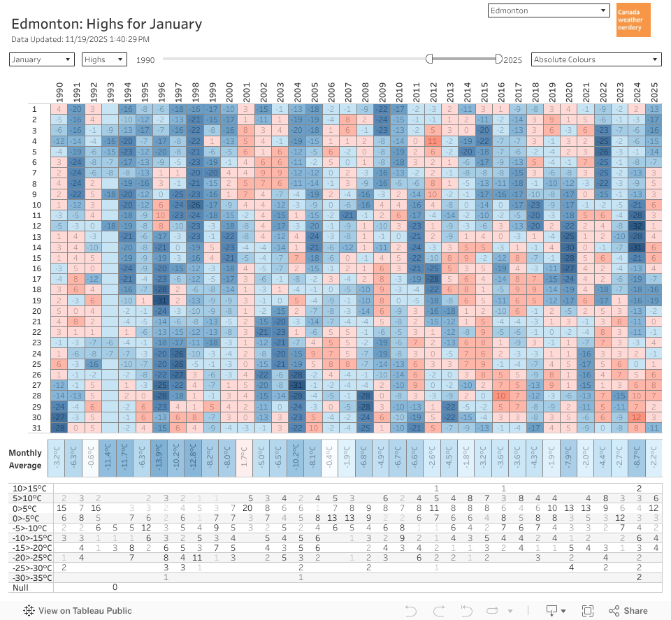
So even in January, our historically coldest month, we typically get around 2 weeks of above-freezing Highs, which includes a week around 5°C. But January also often gets a week of deepfreeze too.

And even a century ago January was a mix of mild days and (extremely deep) deepfreezes.
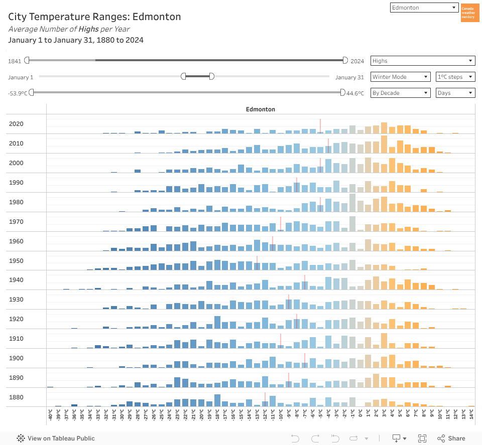
So if we don't get more warm days, but January has warmed by 8-10°C, how does that work?

It's all about the temperature distributions. The top end hasn't moved too much, but a lot of the bottom end has disappeared.
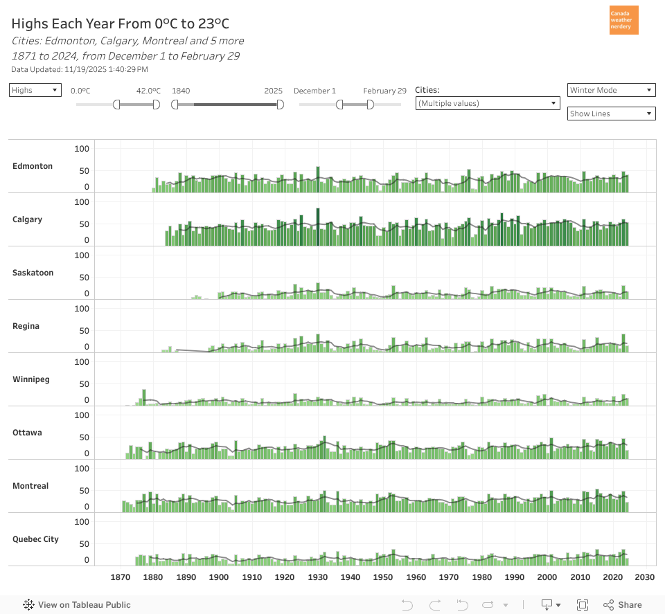
Of Canada's "winter' cities, Calgary's chinooks make it the undisputed champion of mild winter days, with 53 (58%) of Dec-Feb getting above-freezing.

Edmonton, Ottawa & Montréal are around 35. Quebec City & Regina are around 20 Saskatoon & Winnipeg are around a dozen.
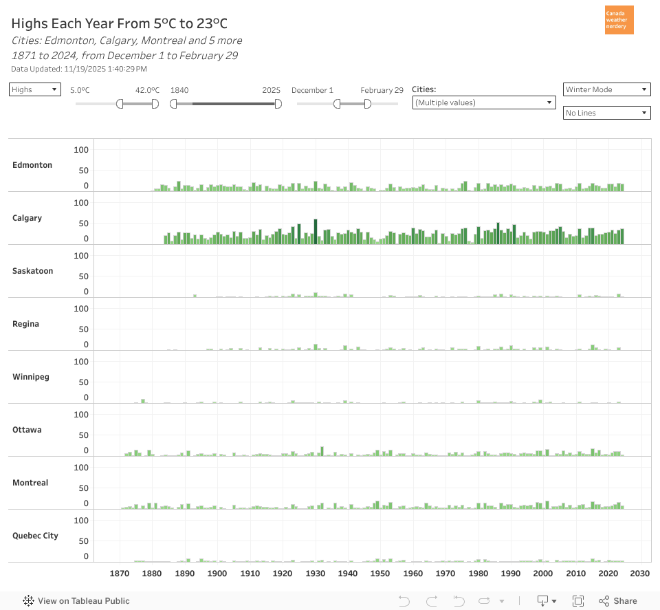
For 5°C winter Highs Calgary is close to 30 (33% of Dec-Feb). Edmonton is around 15. Ottawa & Montréal are around 8. The rest are typically below 5.
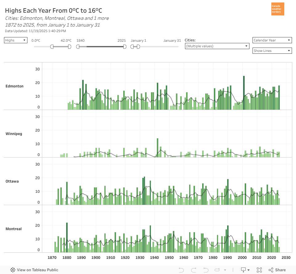
A problem with our temperature swings is it makes winter events tricky.

In the middle of January we can have 5°C Highs or -25°C Lows.

So for skating, icecarving, icecastles, crosscountry skiiing, fatbiking, flying canoes, etc, every few years the weather doesn't cooperate.
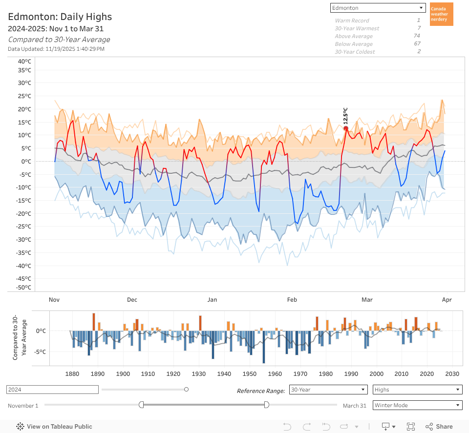
But bringing it all back to the beginning: Our average High is below 0°C from November 19 through March 9th.

In that time we'll probably get 3~4 weeks of deepfreeze scattered around. But we'll also get lots of mild days, with more than 40% of daily Highs above freezing.


And that brings us to the end of Part 1 of our look at Edmonton winters.

This has obviously been Edmonton-centric, but all of these dashboards are interactive, and have similar data for 17 Canadian cities.

Tomorrow we'll be back with Part 2, and a look at Snow.

2018/02/15

If you don't like the weather, wait 5 minutes

Today we're going to look at Edmonton's seemingly-erratic weather.

To get a sense of what I'm talking about, here are our High temperatures for the last few months:


November started out really cold, and it ended really warm. December started really warm and ended really cold. January went cold-warm-cold-warm-cold. And February has mostly been pretty cold. Is this sort of variation normal? Can't we ever have nice, "average" temperatures?

This is a theme we've tackled a few times before in:
  • How Normal is Average - during the summer about 80% of the days are within ±5°C of the average temperature, but in the winter that range doubles to ±10°C.
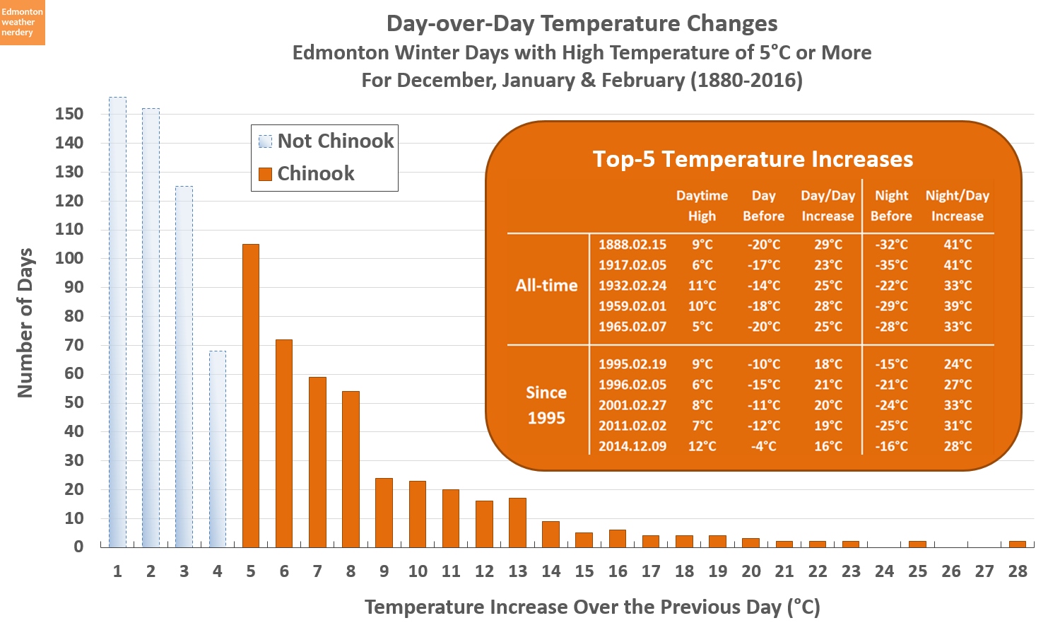
  • Does Edmonton Get Chinooks - we don't necessarily get chinooks like Calgary does, but we do usually see an an echo of whatever they get.
  • 'Tis the season of -20°C - even in the middle of winter we get a lot of warm days to balance off the cold ones.
What we're going to focus on today is how often we swing from warm days to cold days, and then back again.

2017

This is the chart we'll be working with, but it needs a bit of explanation.

This is a chart that we use all the time around here, and it shows daily High temperatures throughout the year. We're going to stick with High temperatures today because they are more variable than the Low temperatures. And so if it feels like our temperatures are behaving erratically then we'll see that more easily with the Highs.

The red and dark blue areas in the chart are the Highs for 2017, and they show whether each day was above or below the average for that time of year. The orange and lighter blue areas in the background show the temperature distribution that Edmonton has seen since 1996, with the warmest, second warmest, coldest and second coldest. The 25th and 75th percentiles are shown as a grey band.

Those 25th and 75th percentiles will be what we're focusing on today. I didn't want to look at just any ol' temperature swing, but wanted to specifically look at when we swing from being warmer than normal to colder than normal, or visa versa. The 25th and 75th percentiles work as handy cutoffs for that.

So with all of that said then: the yellow lines in this chart show every time that the temperature swung from cold (below the 25th percentile) to warm (above the 75th percentile) or the opposite. In 2017 that happened 38 times.

There's a formula controlling all this, and the lines might not exactly match what someone would eye-ball off of the chart, although they should be close. When the temperature spends lots of time hanging around the average that doesn't count as a swing, and if the temperature stays warm or cold for a long time then this chart tries to pick a consistent start or end point. Normally I don't like to invent a bunch of rules for these charts, but we're going to be applying this to 136 years of data, and so it's important to have a standard methodology rather than doing it all by hand.

2017 - Take 2

In 2017 the High temperatures swung between the 25th and 75th percentiles a total of 38 times. But a lot of those happened during the summer when the actual change in temperature was relatively small.

This version of the chart takes all of those swings, and it filters out any where the change in temperature was less than 15°C. That is just an arbitrary cutoff, but a 15°C swing in High temperatures is going to feel like a substantial change no matter where we are during the year - whether it's going from 20°C down to 5°C in June, or from -10°C up to 5°C in February.

Applying the 15°C cutoff filters out the small swings during the summer months, and we are left with a total of 18 swings of 15°C or more for 2017. That includes some very large swings, like in February when things warmed up by 36°C over the course of a week, and in December when temperatures dropped by 31°C over about 2 weeks.

It's important to keep those timeframes in mind, because here we're not necessarily talking about the rapid temperature changes of chinooks (some of Edmonton's largest day-over-day increases are here). Today is more about situations like "It was really warm last week, so why is it absolutely freezing this week?"

2016

As a comparison, here we have 2016. The way that we're measuring things 2016 had a total of 32 swings, compared to 38 in 2017. But when we limit that to the changes of 15°C or more both years had 18. The largest changes for 2016 were a 23°C drop over a week at the end of April, followed by a 26°C warmup in early May.

The beginning of 2016 was the end of a large El Niño, and we can see that for February through late-April the temperatures were mostly well above the average, with only one large temperature swing during those three months.

2015

Here we have 2015. It had 38 swings in total, compared to 32 for 2016 and 38 for 2017. For 15°C swings it had 19, or one more than 2016 and 2017. The largest swings here were a 25°C drop over 4 days in January, and then a 26°C drop over 11 days in February.

The end of 2015 was part of the same El Niño that started 2016, and here again we can see that for October and November the temperatures were mostly above average. But then things did become erratic again briefly during December.

2010 to 2014

And finally, this chart cycles through the 15°C swings for 2010-2014. Here's the summary:
  • 2010: 13 swings of 15°C or more. The largest were a 28°C warmup over 12 days in May, and a 27°C drop over 9 days in November
  • 2011: 15 swings, including a 30°C warmup over 7 days in January, and a 31°C drop over 9 days in November
  • 2012: 14 swings, including a 30°C 5-day drop in January, followed by a 31°C 5-day warmup.
  • 2013: 19 swings, including a 26°C 6-day drop in January and a 31°C 6-day warmup in May
  • 2014: 20 swings, including a 29°C 11-day warmup in January and a 32°C 9-day warmup in December.

Those are just a few examples, and all the years look pretty similar. With these charts it's tough to compare year-to-year though, or to get a sense of what's going on. That's what we're going to try to do next.

History

This chart takes the same approach to counting temperature swings, and it applies it to all of Environment Canada's data going back to 1881. In the earlier charts today we'd looked at all the temperature swings, and at the swings that were 15°C or more. This chart also adds counts for the 25°C and 30°C swings.

When we look at all of the temperature swings, we see that the 38 in 2017 was not unusual. Years like 2012 and 2014 were quite a bit higher with 46. And since the 1880s the 5-Year average has stayed fairly constant, ranging from the low-30's to the mid-40's.

When we move to the 15°C swings the 18 in 2017 were again very typical. Recently a year like 2010 only had 13 of them, but 2003 had 25. And again, the average has been around 18 since the 1880s.

2017 starts to look a bit unusual when we move to the 25°C and 30°C swings. 2017 had 7 swings of 25°C or more, including 2 of 30°C or more. Recently 2009 and 2011 both had about that many swings. To find a year which had significantly more we need to go all the way back to 1990, with 9 swings of 25°C or more, including 5 of 30°C or more. Going all the way back to the 1880s it looks like the number of large temperature swings has dropped a bit, although that's probably because we don't see High temperatures of -30°C or -40°C anymore.

So 2017 was not exceptionally erratic, but in terms of really large temperature swings it was a little bit on the high-side of what we would typically see.

1990

Here we have 1990, which is the only recent~ish year which had more large swings than 2017 did. 1990 had 41 swings total, 25 of 15°C or more, 9 of 25°C or more, and 5 of 30°C or more.

It looks a lot like all of the other charts from today, but there are a few really extreme months here. From mid-January through late-February there were a series of 30°C swings, and then in November and December the temperatures bounced around constantly.

Summary:

Today we've looked at how often Edmonton's temperature swings from above-average to below-average, or visa versa. This isn't just warm days or cold days, but is how often our weather switches between noticeably warm and noticeably cold.

This discussion was prompted by the question: "Was 2017's weather more erratic than normal?" That's a big question, and so to try to answer it I settled on the approach that we're using here - counting temperature swings between the 25th and 75th percentiles. That choice was arbitrary and it doesn't hold any deep meaning, but it did give us a consistent methodology to apply.

On average we saw that these temperature swings happen about 35 times per year, or about every week-and-a-half. That number varies from year-to-year, and during the summer the temperature swings are smaller than they are during the winter. But overall the numbers have stayed reasonably consistent over the last century, although the very largest swings have decreased a bit in the last few years.

The title today "If you don't like the weather, wait 5 minutes" is a quotation that's originally attributed to Mark Twain. He would have been referring to the weather in New England, but it's also a popular sentiment in Alberta. And it turns out that it's not entirely wrong, but rather than every 5 minutes it's more accurately about every 10 days.

2017/05/15

How Normal is Average?

A week ago we had a heatwave, and this week we're almost dropping below freezing. It sure seems like temperatures have been bouncing around a lot recently, so today things are going to get extremely nerdy as we look at average temperatures.

Environment Canada data from our record-breaking May 5th, and not-so-record-breaking May 14th

Environment Canada and other meteorologists will often mention seasonal normals, and the question today is: just how "normal" is the average? I've talked about this a few times before, but today we're going to see just how much time we spend at-or-near the average.

(Just for house-keeping purposes, today we''ll be looking at the average temperatures from 1996-2017. A 30-year average is more typically mentioned, but I like 1996 because that was when measurements from the current weather station at Blatchford started. I've talked about the measurement differences between weather stations here.)

2017 so far...

This chart shows the High temperatures for January through May 13, 2017. We can see all of the wild temperature swings that we've gone through, and it highlights how many days were "close" to the average: whether ±1°C away, ±3°C, ±5°C or ±10°C.

The number of days so far this year that were within 1°C of the average is pretty tiny, with only 10 days scattered over the last 4-and-a-half months. ±3°C from the average puts us at one-quarter of the year, and ±5°C moves us to about one-half. Days that are within 10°C of the average captures about three-quarters of the year so far, but we've had several coldsnaps and warmspells which fell outside of that range.

We're only 4-and-a-bit months into 2017 though, so lets take a look back at last year.

2016 Highs

Here we have the High temperatures for 2016, and how many degrees they were away from the recent average.

And the temperatures last year bounced around quite a bit as well. Throughout 2016, 13% of the daytime Highs were within ±1°C of the average, and most of those were right in the middle of summer. For ±3°C it was 37%, for ±5°C it was 56%, and ±10°C was 87%. But to cover 100% of the days - from the May heatwave to the December coldsnap - we have to go all the way to ±18°C.

To dig a little deeper, lets focus on one slide from that animation:

±5°C from Average

Here are the days last year which were ±5°C from the average. 

A range of ±5°C from the average covers 56% of the days from last year. But in the Summer months 84% of days were in that range, while in the Winter it was only 38%. And that's because our range of potential temperatures is much smaller in the Summer than it is during the Winter. A summer day might be anywhere from 10°C up to 35°C, while in winter it could be -30°C to +15°C.

I don't usually talk about Standard Deviation on this blog, but today we'll make an exception because it's really a perfect demonstration of this:

Standard Deviation Throughout the Year

Standard Deviation is a measure of how variable a set of numbers is, and how far they are from the average. In Edmonton, that temperature variation gets much smaller as we move from the Winter into the Summer.

Based on data from 1996-2017, during the winter the standard deviation for our High temperatures is about 9°C. And so about 68% of winter days will fall within ±9°C of the average, and 95% of days will fall within ±18°C.

For the summer though, the standard deviation for Highs drops to about 4°C. And so 68% of the time we'll be within ±4°C from the average, or 95% of the time within ±8°C. For Low temperatures it's even smaller, dropping to about 2.5°C for June through September.

Intuitively this makes a fair bit of sense. If our average temperature in January is around -5°C, then in a typical winter we will certainly bounce up or down 15°C with chinook-days of 10°C or deepfreezes down to -20°C. On the flipside, during July the average is about 23°C, and we've never recorded a single day 15°C above that, at 38°C.

Anyway, that's enough stats.

So far we've looked at the first few months of 2017, and at all of 2016. But how do things compare over the longer term?

Highs for 1996 to April 2017

Here we are looking at each year going back to 1996, and at how much of it was in the range of ±1°C from the average, ±3°C, ±5°C, ±10°C and beyond.

From this chart, you can see roughly how warm or cold a year was based on how high the bar sits. 2015 and 2016 were both warm, so they are up above the 60% mark, meaning they were above average more than 60% of the time. And as we've seen previously, 1996 was one of Edmonton's coldest years since the 1950s, so it drops down below -60%. The more typical years sit balanced somewhere between +50% and -50%.

When we looked at 2016 we saw that 13% of the year was within ±1°C of the average. For all of the years that increases to 14%. And it's pretty consistent, because the lowest year was 2002 at 10%, and then there are 5 years at 16%.

For the ±3°C range it was 37% for 2016, compared to 38% for all these years. 2002 is again the low year at 33%, and for 2007 44% of the year was within 3°C of the average.

Moving on to ±5°C, 2016 was 56% compared to a recent average of 58%, with 2002 at 48% and 2007 at 65%.

And finally, for ±10°C 87% of 2016 was in the range, the average is 88%, 2009 is the low at 83%, and 2012 is the high at 92%.

So even though 2016 was a fairly warm year, the amount of time that it spent near the average temperatures was fairly average. 2017 looks a little different from all of the rest, but that's because right now we only have data from the erratic winter and early-spring, and we're missing the summer months with their tiny temperature ranges to balance things out.

Another way to look at this is as a breakdown of all the days:

Distribution of Highs

With this chart we lose track of the individual years, but we do get to see how things have generally been distributed over the last 2 decades.

This is broken into summer (April-September) and winter (October-March). For the summer Highs the numbers are nicely centered around ±1°C, and they stretch from 16°C below-average to 17°C above. The winter Highs have a much longer tail - stretching from 27°C below-average to 20°C above - and are skewed so that Highs of 4°C or 5°C above the average are actually the most typical.

Now lets take a quick look at the Low Temperatures. We'll just zip through these, since it's the same basic idea.

2017 Lows

So far in 2017 the Lows have also swung around pretty wildly, and the coldsnaps and warmspells are easy to spot in this chart. But when we looked at the Standard Deviations earlier, we saw that Low temperatures are actually a little bit less variable than the Highs, and we see that here too:


For each of these ranges, more Lows are closer to the average than the Highs were. So for the ±1°C days which are basically right on the average, there were twice as many Lows as Highs. And as we move up to ±3°C about 10% more Lows fell in that range than the Highs, and that continues for ±5°C and ±10°C.

In particular, the Lows for April of this year were very close to average, mostly sitting within ±3°C. But everyone will remember April as being a cold month, because the Highs were sitting around 10°C below average for several weeks.

Lows for 1996 to April 2017

Finally for today, this is the breakdown for the Lows going back to 1996.


And similar to what we just saw for 2017, the Lows are a little bit closer to the average than the Highs, which isn't surprising knowing that the standard deviations are lower. The Lows are right on the average about one-fifth of the time, within 3°C half of the time, and within 5°C three-quarters of the time.

Distribution of Lows

Here we have the distributions again, for Lows during the summer (April-September) and winter (October-March).

The summer Lows are centered on ±1°C, and range from 13°C below-average to only 10°C above. That very small range of temperatures matches what we saw with the standard deviations earlier. The winter Lows are more spread out, from 25°C below average to 17°C above.

Summary

So how close are our temperatures to the average?

Throughout the year we are within 1°C of the average about 15~20% of the time, which I guess isn't too bad? But that depends a lot on what part of the year it is. In Summer 80% of the days are within ±5°C of the average, but in the Winter that range doubles to ±10°C.

In the middle of winter no one wants to hear a forecast that "tomorrow will be 10°C below normal." But the truth is that it is perfectly normal for about one-fifth of the winter to be 10°C from the the average (sometimes below, but sometimes above).

So while "normal" is a term that weather-people have borrowed from statistics, it's not great. The temperatures are "average" sure, but they're not really something you should expect on a daily basis.

2017/01/16

January Unicorns

Did you hear that it's supposed to be warm this week?

In January??

In Edmonton???

But that sort of thing never happens.

...


I've talked about this many times before, but warm January days in Edmonton are actually pretty common. One might even call them reliable, since they happen every year, to one degree or another:


Perhaps more surprising is the fact that warm January temperatures were also pretty reliable over a century ago:


(...although take a look at some of the cold days in that table: -39°C and -40°C as daytime highs5°C one day, and then -40°C a week later...)

Yesterday the temperature made it all the way to 7.1°C, which was a nice surprise:


That made it the 4th warmest January 15 every recorded, but below both 2014 and 2013 which are 1st and 2nd respectively (3rd was 7.2°C in 1965). And 2013 and 2014 also had the 1st and 2nd warmest low temperatures.

If we just look at this week in history, January 16-20th:


Here we have the 50 warmest recorded days for the week of January 16 through 20th (technically 57 warmest, because there's a tie for 50th).

Again we see that both 2013 and 2014 were pretty warm during this week in January, and look pretty similar to what's being forecast for this year. Based on those forecasts we might get a day or two into the top-50, but if we want to break a record the best bet would be today. The 7.2°C record for January 16th was set way back in 1884, and it's pretty low compared to the other days this week.

So enjoy the warm weather, but it's not a unicorn.