Today we are going to take another look at the Urban Heat Island Effect. This is the idea that cities are warmer than rural areas, and that cities are also warming faster than rural areas, because cities absorb, generate and concentrate heat.
Why is the heat island effect interesting?
- Every day in Edmonton we see temperatures from downtown, and at the airport. There is often a huge difference between the two stations: 5°C, or even 10°C. So it is really easy to get into the mindset that Edmonton is warm because it is a city, and that if the city were not here then the temperatures would match the Airport, because the Airport is the "natural" state. But it's more complicated than that.
- Climate change deniers like to use the heat island effect to dismiss climate change, and to say that all data is biased because of course cities are getting warmer and yadda yadda.
Today we will mostly be looking at the first point, although some of that will spill over into the second point too.
The reason for today is because we just had a historic heatwave, and maybe the heat island effect looks different during extreme temperatures?
Heatwave 2021
This chart cycles through the daily High and Low temperatures for Environment Canada stations in the Edmonton area for June 24th through July 3rd. The main 30°C+ heatwave was June 25th through 2nd, but the 24th and 3rd were also pretty warm, so they're included here too. The dashboard with this daily data is
here, but it's pretty slow so we will stick to images for a bit.
The Blatchford station near downtown is at the centre of the group of stations. For the Highs Blatchford was usually among the warmest stations, but several of the outlying stations like Namao and St. Albert had hotter days. And for cooler stations the International Airport's Highs were generally 1°C or 2°C below everywhere else.
For the Lows Blatchford was the warmest of the group for every night here, except for June 30th when it was below the Namao and Oliver stations in the northeast. For the nights when Blatchford was the warmest it could be 1°C, or 2°C, or even 5°C warmer than some of the other stations.
And this is where we fall into the trap: cities are warm, and so the reason that Blatchford is warm is because it's in the big city, right? Let's see...
Heatwave 1961
Here we have the temperatures for the great heatwave of June 1961. There are fewer stations, so this one is zoomed out a bit, and in the upper left corner is Campsie which is about 100km northwest of Edmonton.
For the Highs Blatchford's temperature was fairly similar to the other stations, and Fort Saskatchewan in the northeast had several of the hottest days, by about 1°C. For the Lows Blatchford was consistently warmest again, and again by anywhere from 1°C, to 2°C, to 5°C depending on the station and the day.
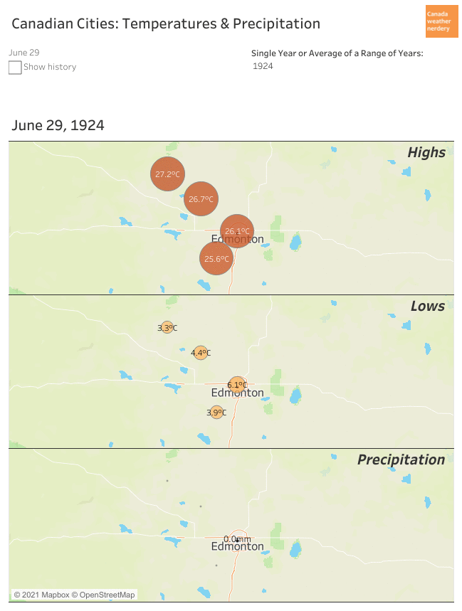
Heatwave 1924
And finally, here is the earliest of our recorded heatwaves, for June and July 1924. This time we only have records from 4 stations.
For the Highs all of the stations take turns as the daily hot spot. For the Lows Blatchford is the warmest for most days, and again by anywhere from 1°C, to 2°C, to 5°C.
This set of charts isn't great for spotting trends, but just generally it looks like the temperature distributions around Edmonton weren't all that different for the heatwaves of 1924, 1961 and 2021:
- In 2021 Blatchford's Highs were similar to the neighbouring stations, and didn't get a boost just for being in the big city.
- In 2021 Blatchford's Lows were usually several degrees warmer than the outlying areas, but that was also the case in 1961 and 1924 when Edmonton was much smaller.
Campsie vs Blatchford Through History
In this chart we have the 20-year average temperature difference throughout the whole year between Edmonton and Campsie. It has 3 different time periods: 2001-2020, 1961-1980 and 1915-1934.
The dashboard with all of this data is
here.
Campsie is a great station to use as a guinea pig because it has data from all of the way back in 1915 through today, and so we can get a sense of how things have changed over the (relatively) long term.
For the average Highs Blatchford is warmer than Campsie, but only by a little bit. The average differences during the whole year were 0.1°C for 1915-1934, 0.5°C for 1961-1980, and 0.3°C for 2001-2020. The difference tends to be the greatest during the winter, but the Highs are pretty close overall.
The Lows look quite different from the Highs, with a big gap between Campsie and the warmer Blatchford. The average differences were 2.6°C for 1915-1934, 3.4°C for 1961-1980, and 3.3°C for 2001-2020. The difference in Lows is also more seasonal than the Highs, with some winter days averaging 5°C or 6°C warmer in Edmonton, while the summer days are mostly below 4°C.
Campsie vs Blatchford Heatwaves
This is the same chart that we just saw, except this time we are zoomed right into the heatwaves of 1924, 1961 and 2021. It looks a little bit less pretty like this, but this shows the individual daily temperature differences between Blatchford and Campsie.
We saw earlier that during the year Blatchford's High are on average less than 0.5°C warmer than Campsie's. That doesn't seem to change much during historic heatwaves, because for almost all of the days here there's only a fraction of a degree between the two stations. The one notable exception was the final day of the 1924 heatwave where Blatchford was 10°C warmer than Campsie. But generally the Highs are really close, and they were also really close in 1961 and 1924.
For the Lows Blatchford averaged 4.9°C warmer than Campsie in the 1924 heatwave, 6.6°C in 1961, and 5.8°C in 2021. All of those numbers are above the typical summer difference which is less than 4°C. But just among these heatwaves, Blatchford's Lows were extra-warm for all 3 of them, and didn't get a particular boost in 2021.
We are going to end things here for Part 1. For right now the take away is that:
- For the 1924, 1961 and 2021 the Highs for Edmonton and Campsie were generally very close (except on July 3, 1924).
- At first glance Blatchford's warm nights in 2021 definitely looked like the heat island effect at work. But the vast majority of that difference also occurred 97 years ago in 1924.
Digging into the daily temperatures for these 2 stations to look at 3 heatwaves spread across a century is definitely cherry-picking the data. In Part 2 we are going to take a step back to look at some larger trends.


Here is an interesting read on heat islands: https://www.nasa.gov/topics/earth/features/heat-island-sprawl.html
ReplyDeleteThey recognize that the compactness of the urban cores is a major factor. Sprawling cities like Edmonton would not have the same heat island as major US cities.
This chart also shows that daytime air temperature does not reflect the heat island. It is the land temperature in the day that heats up, and the overnight temperatures were it really becomes apparent: https://www.nasa.gov/images/content/505102main_Figure4.JPG