
We will start with a caveat: I am not an expert on this. If any experts read this they will think "This person is not an expert" and they will be correct, because I am not an expert.
But at the end of May 2019 Edmonton had a very, very, very, very, very, very, bad day for Air Quality.


During that very bad day Environment Canada and the media were focused on real-time reporting, because the public needed to be warned about the health risks. But hearing things like "On a scale of 1 to 10 this is a 9...now it's 12...now it's 25...now it's 72" left me with a lot of questions.
- How often does it happen?
- How often does it happen in May?
- How does it compare to August 2018?
- How bad is it?
- Has it ever been this bad before?
I was unable to easily find answers to those questions, and so this is the Edmonton Weather Nerdery attempt at providing some context. All of the data today is from the province of Alberta, with the realtime data available at http://airquality.alberta.ca/map/ and the historic data from http://airdata.alberta.ca/.
Normally on this blog we talk about things which are pretty straightforward and objective like temperature: 0°C = 32°F = 273.15K. Air quality measurements are a bit different because they are an attempt to quantify the health effects that poor air has on people. Today we will be looking at two different scales - AQHI and AQI - and those numbers won't be a perfect match, and that is okay.
Let's jump right in with a dashboard that has a lot of things going on:
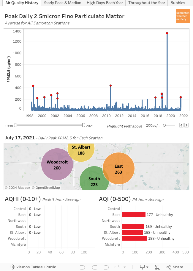
This dashboard is interactive, and as you hover your mouse over it (sorry, mobile users!) the data will update for different days going back to 1998.
Some Background
Stations:
- Edmonton has 7 stations recording hourly air quality.
- The Northwest station has data for 1998-2004; Central & East began in 2001; and the other stations began after that.
- Some stations only record FPM2.5 (which we will explain in a second) while others also record Ozone and Nitrogen Dioxide.
- The map in the middle of the dashboard shows the highest hourly FPM2.5 for each station on a given day.
FPM2.5:
- FPM2.5 is the measurement of the mass of Fine Particulate Matter (2.5 micron) in the air in µg/m³. When the air is smokey that level of FPM2.5 goes up.
- The chart at the top of the dashboard shows the peak daily FPM2.5 averaged for all stations.
- The red dots highlight days with a peak FPM2.5 averaged for all stations of more than 200µg/m³. Typically we are around 20µg/m³, and so the red dots are 11 of the very worst days for Air Quality in the Edmonton region in the past 2 decades.
AQHI:
- The Air Quality Health Index (AHQI) was created by Environment Canada and is only used in Canada.
- It is calculated from the levels of FPM2.5, Ozone & Nitrogen Dioxide. (Alberta uses a slightly modified version of the AQHI but to track other compounds, but to keep things simple we will be sticking with the Environment Canada Standard)
- At the bottom left of the dashboard is the highest 3-hour average AQHI for each station on a given day.
- AQHI has a scale of 1-10+.
- From Wikipedia:

AQI:
- The Air Quality Index (AQI) is at the bottom right of the dashboard.
- AQI is used internationally.
- Separate AQIs can be calculated for individual compounds (Ozone, Nitrogen Dioxide, Sulfur Dioxide...) but we will only be using the level of FPM2.5.
- At the bottom right of the dashboard is the 24-hour average AQI for each station on a given day.
- AQI has a scale of 1-500.
- From Wikipedia:

One thing to point out is that all of these are measured hourly, but AQHI is calculated as a rolling 3-Hour average, while AQI is a daily average. So in the charts today we will have a mix of peak daily FPM2.5 (because I think the peak is interesting), peak 3-hour average AQHI, and 24-hour average AQI.
With that background out of the way, lets take another look at the data:
May 30, 2019
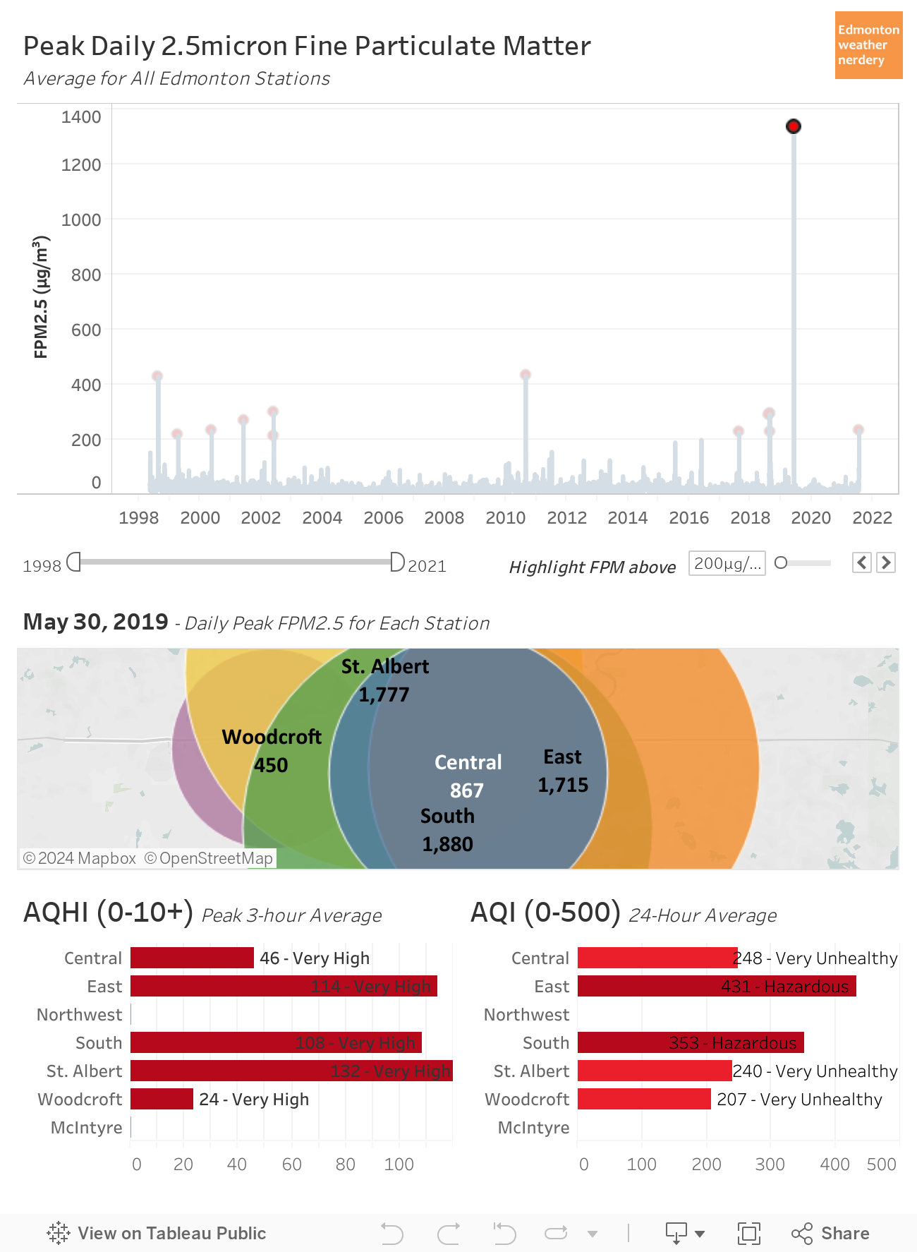
So how bad was the air quality on May 30, 2019? Unfortunately we don't have a lot of history to compare it to because the data only goes back to 1998, but based on what we do have May 30, 2019 was off the charts.
- The average of the peak FPM2.5 for all of the stations was 1,338µg/m³. Since 1998 the previous record had been August 19, 2010 way down at 433µg/m³.
- The peaks for the individual stations ranged from Woodcroft at 450µg/m³; to Central at 867µg/m³; to East & St. Albert above 1,700µg/m³; and South was at 1,880µg/m³. The previous highest measurement at any station had been 450µg/m³ at the Central station on August 19, 2010.
- The highest 3-Hour average AQHI (on a scale of 1-10+) ranged from Woodcroft at 24, Central at 46, South at 108, East at 114, and St. Albert at 132. The previous highest AQHI since 1998 had been 23 on August 19, 2010 again.
- The AQI for the day (on a scale of 0-500) ranged from Woodcroft at 207 (Very Unhealthy) to East at 431 (Hazardous). The previous highest AQI since 1998 had been 222, also on August 19, 2010.
At the time it seemed like May 30, 2019 was extra-bad, and the data backs that up:
- a typical day is around 20µg/m³.
- a really, really bad day (10 in the past 20 years) hits 200µg/m³.
- the previous worst-of-the-worst days (2 in the past 20 years) hit 400µg/m³.
- and May 30, 2019 blew them all away with readings of 850, 1,400, 1,880, etc.
A Brief History
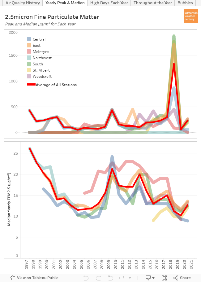
This dashboard shows the highest FPM2.5 and the median FPM2.5 for each year for all of the stations. With this we can see how things have changed on a yearly basis.
A few cautions about this:
- This uses the yearly median FPM2.5 because the yearly mean (what we typically think of as an average) is too susceptible to extreme values. If we have 1 day at 1,880µg/m³ that is the equivalent of 90 "typical" days, and it drags the yearly mean way, way up. The yearly median is a better representation of a "typical" day throughout the year.
- The red line is the average of all the stations, but this is affected by which stations have available data:
- For 1998-1999 only the Northwest has data available, and its yearly mean tends to be higher than the other stations. So the "Average of All Stations" looks really high for 1998-1999, but that's because it is just the one station.
- For 2006-2019 the McIntyre station starts reporting, and its yearly mean also tends to be higher than the other stations, and so that also drags the overall average up.
20 years isn't really enough time to identify long-term trends, but with what we have available we can see:
- A low yearly peak is around 100-150µg/m³, but 2002, 2010, 2013, 2014 & 2016-2019 all had at least one station with a peak of 300µg/m³. There have been more high-peaks in recent years, but that might just be because there are more stations reporting.
- For the yearly median most stations are between 12-20µg/m³. But for both Northwest and McIntyre the median is often 5µg/m³ more than the other stations.
- 2010 is a standout year, with all of the stations having a peak between 400-450µg/m³, and the yearly mean for all of the stations was also higher than normal, ranging from 20-25µg/m³.

The 24-hour average target is 29µg/m³, and today we're mostly focusing on peak-numbers so we will maybe take a look at that at some point in the future. But for peak-numbers, Alberta's 1-hour target is 80µg/m³, and in the next section we will look at how often we high days.
High FPM2.5 Days Each Year
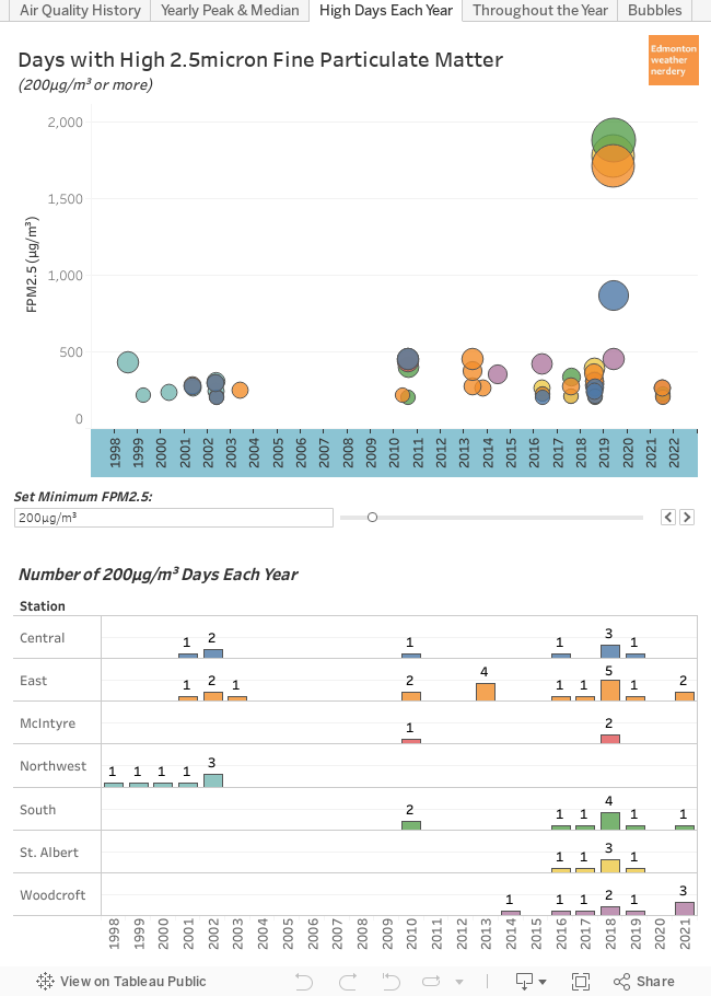
Here we are looking at the number of days with high FPM2.5 each year. The default for this dashboard is 200µg/m³ because that is a pretty bad day, but it can be adjusted to show 50µg/m³, or 100µg/m³, or 400µg/m³, or Alberta's target of 80µg/m³.
We've previously seen that 2010 & 2019 each had a really bad day, with FPM2.5 hitting more than 400µg/m³ and 800µg/m³ respectively. Those really bad days show up in the top part of this chart.
In the lower part of the chart we can also see that 2018 had a bunch of pretty bad days. The various stations recorded 3-5 days with FPM2.5 from 200-400µg/m³. That isn't as high as the peaks of 2010 & 2019, but in 2018 there were more days. If we lower the cutoff to 100µg/m³ (which is still pretty bad) 2018 had 6-8 days depending on the station, while 2010 had 4-7 and 2019 had 2.
These photos are from August 15th (average FPM2.5 of 187µg/m³), 16th (112µg/m³) & 17th (229µg/m³) 2018:


August 10th & 18th 2018 were both the worst of that week at 287µg/m³ and 293µg/m³, but I don't have any photos for those days. For most of the days that week the AQHI peaked from 8-14, and the daily AQIs were around 160-190. And in August 2018 things first got bad on August 7th with FPM2.5 of 74µg/m³, and they stayed pretty high until about August 26th.
So 2019 had one really, really bad day. 2010 had one really bad day, and a few more pretty bad days. And 2018 had a week of pretty bad days, and August was pretty rough overall.
FPM2.5 Throughout the Year
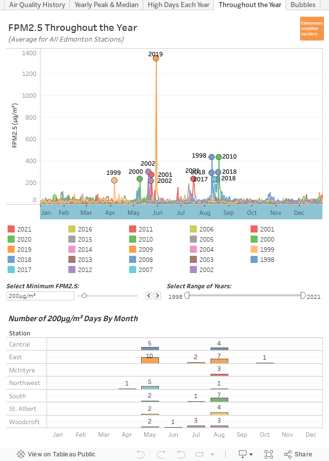
When our air turned to soup on May 30, 2019 a lot of people were saying "It's never this bad in May." We've already seen that May 30, 2019 was undeniably the worst-of-the-worst-of-the-worst, but this chart shows when throughout the year we get other pretty bad air quality days.
In the past 20 years our pretty bad air quality days have mostly been split between May and August:
- For May
- May 30, 2019 was terrible.
- The Ft. McMurray wildfire was at the very beginning of May 2016, and Edmonton's air quality was generally fine, except for a single 200µg/m³ day on May 19th.
- 1998, 2000, 2001 & 2002 all had high FPM2.5 days in May.
- For August
- August 2018 had a whole bunch of pretty bad days.
- August 19, 2010 was a very bad day.
So it is true that in recent years August is the month for bad air quality, but going back a little bit further May has a history of it too.
Summary
Today we have mostly focused on the amount of 2.5micron Particulate Matter in the air. FPM2.5 is important because it is used to calculate the AQHI and AQI which are reported whenever the air quality is poor.
- May 30, 2019 was Edmonton's worst air-quality day since 1998 by far. August 19, 2010 was the 2nd worst, but it wasn't even close. It is unfortunate that the data doesn't go further back than 1998, though.
- August 2018 was also notable, with about a week of pretty bad days.
- Recently August has had most of our bad days, but around 2000 there were also a number of them in May.
- Over the past 20 years our "typical" FPM2.5 throughout the year has stayed fairly consistent at around 20µg/m³. And the worst days each year typically peak at 150-400µg/m³...until May 30, 2019 averaging 1,338µg/m³ for all the stations.
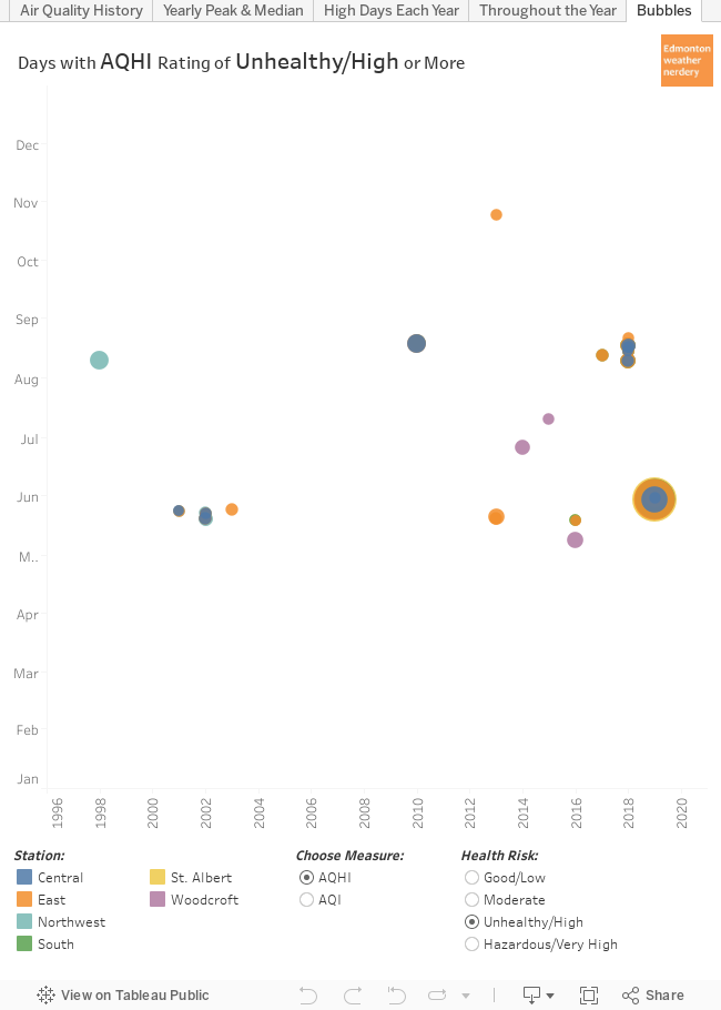
This final dashboard lets you filter by all the unhealthy/high/hazardous days at the various stations, using either AQHI or AQI. The ratings aren't a 1-to-1 match: in particular AQI puts a lot of days in the moderate category that AQHI ranks as low. But for the days with poor air quality the two scales have a lot in common.
Hopefully this all gives some context to Edmonton's recent history of Air Quality. The next time that the smoke rolls in it is important to remember the difference between the AQHI (Canadian, with a range of 1-10+) and the AQI (International, with a range of 0-500), and that both of them are mostly calculated using the FPM2.5.
No comments:
Post a Comment